AI Data Visualization Platform
Dashboards, Charts, Maps, Storytelling and AI Chat in One Connected Workspace.
Turn raw data into dashboards, charts, and reports your team can understand at a glance. Start from a CSV or connect an API, build the view around your KPIs, and share results with your team in minutes. Fusedash brings interactive data visualization, maps, storytelling, and data chat into one workflow, so teams spend less time rebuilding reports and more time acting on insights.
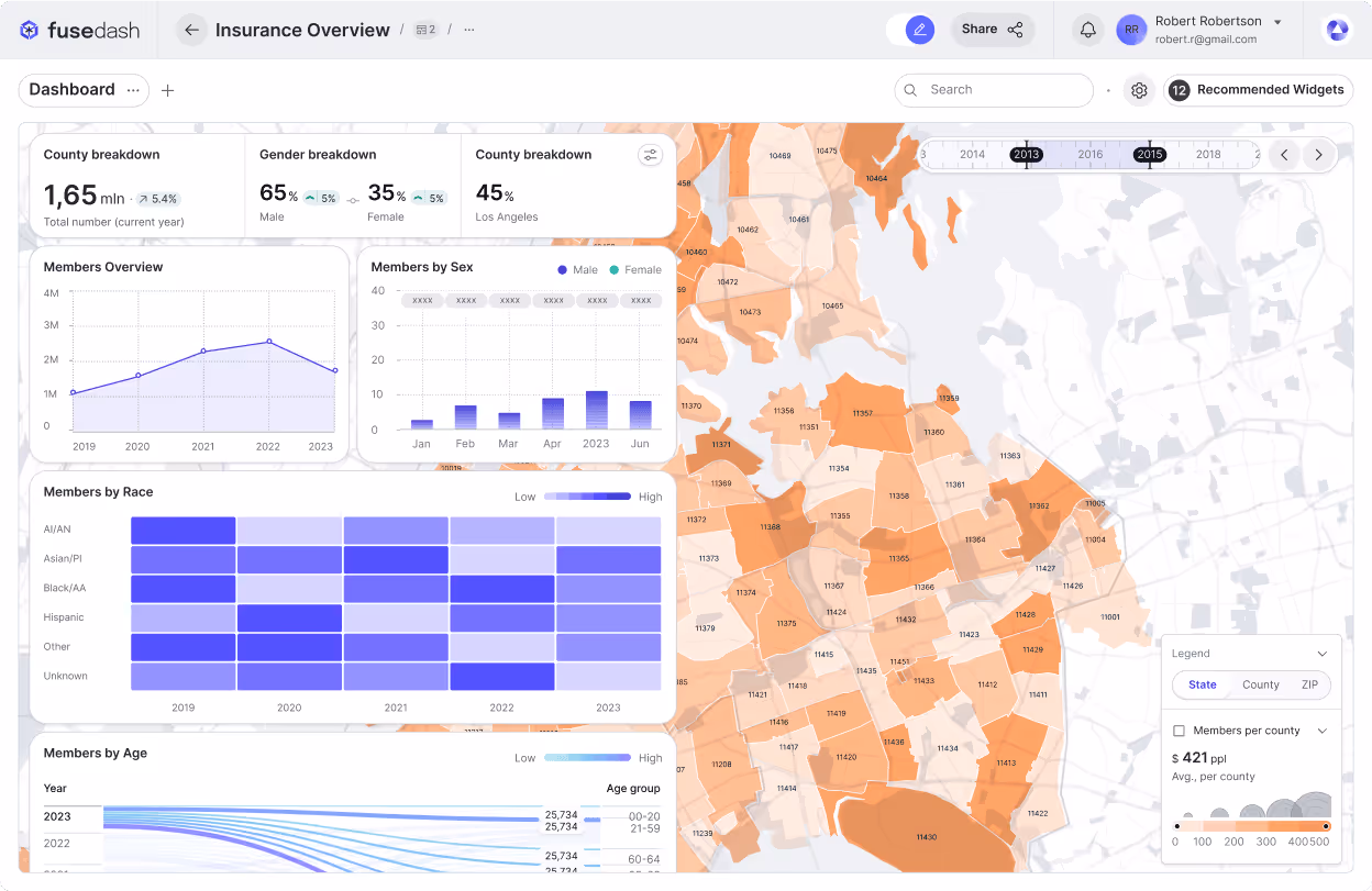
Build the Right Dashboard View for Every Audience
Different teams need different answers. Fusedash lets you turn the same dataset into dashboards, charts, maps, or report-style views, so stakeholders see what matters without extra back and forth. Customize layouts, filters, and time ranges, then reuse the same structure across teams.

Create AI-Powered Charts from your Data
Generate clear visuals from CSVs or APIs in minutes. Use Fusedash as a fast data visualizer to pick the right chart type, apply comparisons, and refine labels so charts tell the story correctly. Drop charts into dashboards or use them as standalone visuals for reporting.
- Generate charts from your dataset in seconds
- Add comparisons, filters, and clear labels
- Reuse charts across dashboards and reports
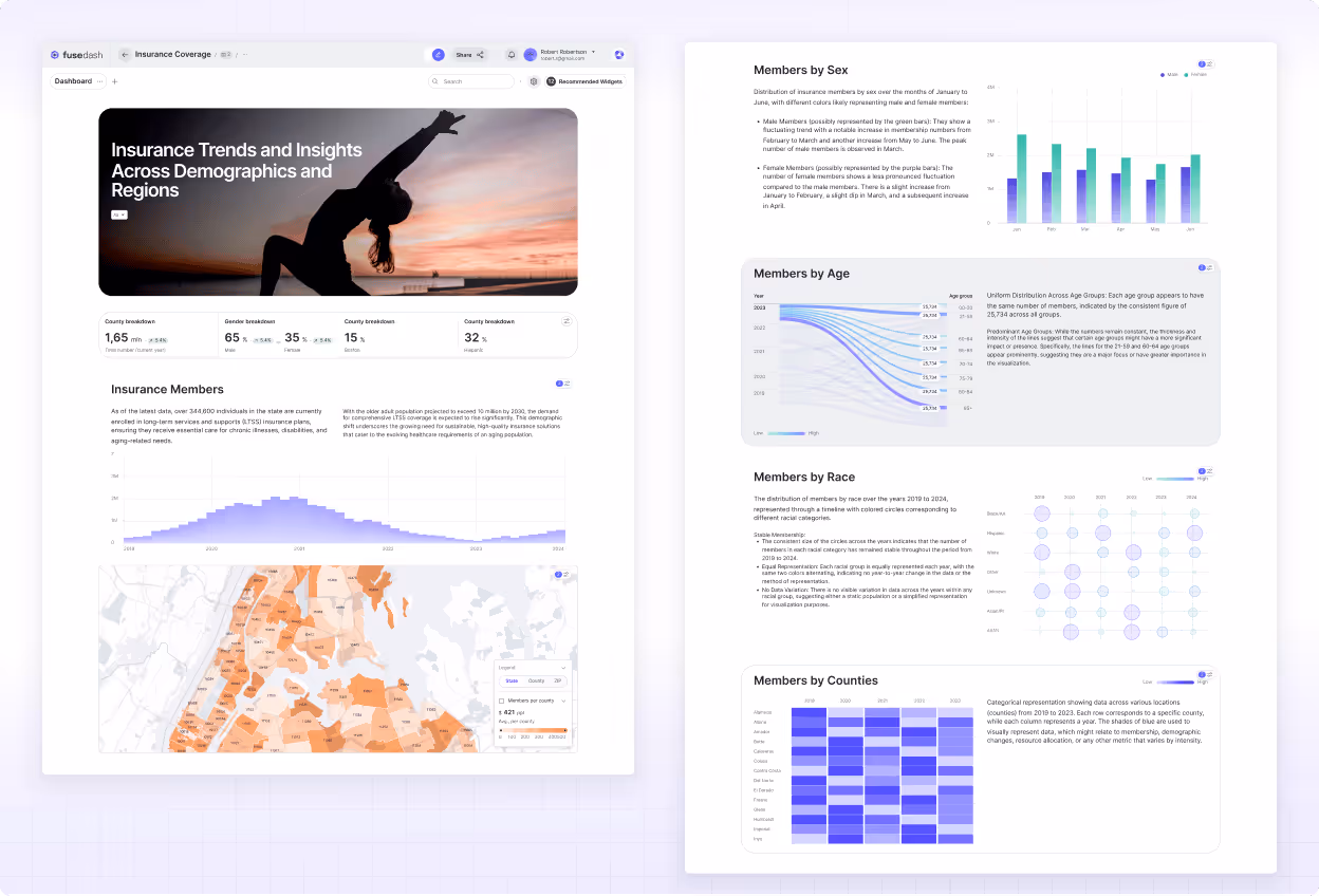
One Workspace for Dashboards and Reporting
Dashboards are great for monitoring KPIs, but leadership and stakeholders also need context. Combine performance views with narrative reporting so it is clear what changed, why it matters, and what happens next using Storytelling. This keeps teams aligned and reduces conflicting versions of the same report.
- One workspace for dashboards and reporting
- Share consistent views with stakeholders
- Add context with storytelling sections
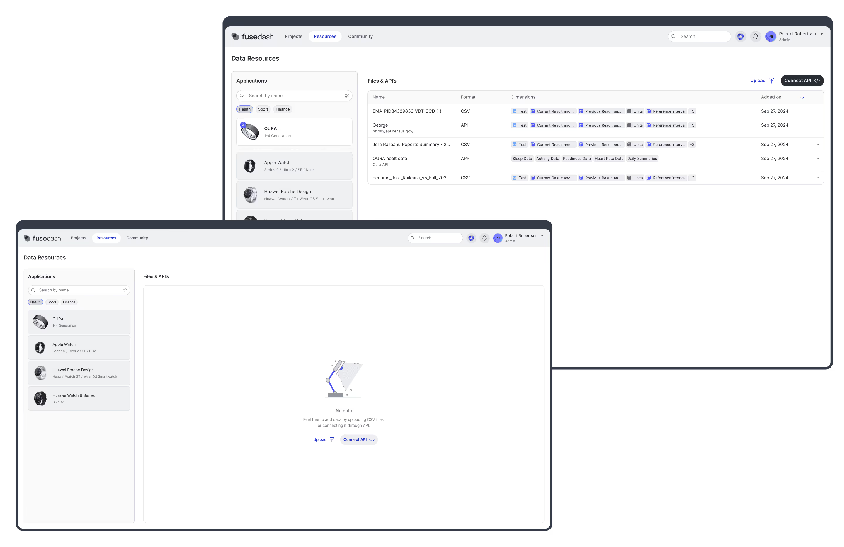
Combine CSV, APIs, and Public Data in one Platform
Bring your data together without rebuilding the same work. Upload CSVs, connect APIs, and enrich views with public data when location or market context matters. As an AI data visualization tool, Fusedash helps you keep datasets organized and reusable across charts, dashboards, and reports.
- Upload CSVs or connect APIs
- Combine datasets for a single view
- Reuse the same data across pages
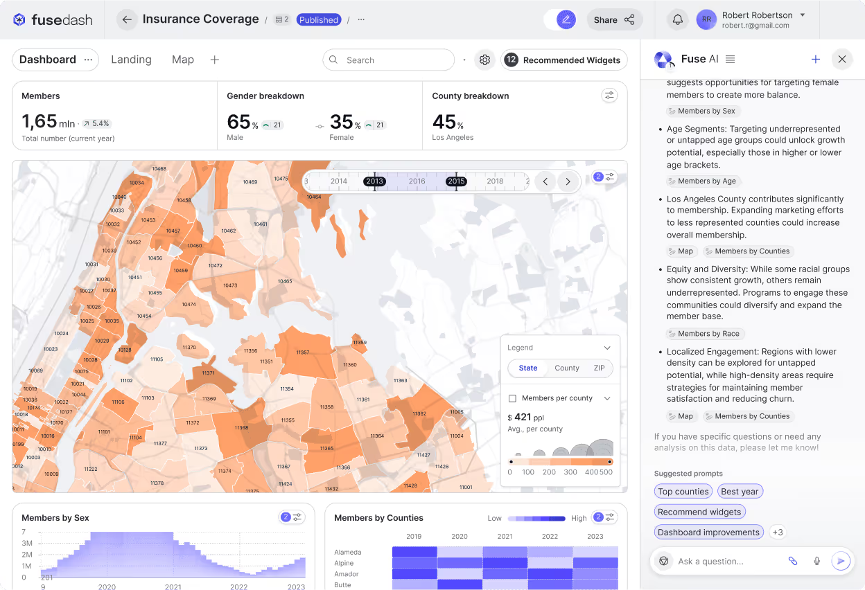
Ask Questions and Refine Dashboards with Smart Chat
When you are not sure where to start, Smart Chat helps you move faster. Ask questions in plain language, explore breakdowns, and get suggestions for the best chart or metric set. Then turn answers into a shareable view your team can use immediately inside dashboards.
- Ask questions about your data in plain language
- Get suggested metrics, charts, and breakdowns
- Turn insights into shareable dashboard views
How Fusedash works
Connect your data once, then use the same dataset to build dashboards, charts, maps, storytelling reports, and real-time monitoring for every team.
.png)
Connect your data
Start from a CSV, connect an API, or plug into your database. Keep historical context, set refresh schedules, and prepare your dataset for reporting, monitoring, and analysis in one workspace.
Define metrics that stay consistent
Create KPIs and dimensions you can reuse everywhere so dashboards, charts, and reports always match. Standardize time comparisons, segments, and definitions so teams review the same numbers and trust the result.
Build the right view for each audience
Switch from interactive dashboards to charts, maps, and report-style storytelling without duplicating work. Add filters, drilldowns, and comparisons to answer what changed, where it changed, and what is driving it.
Add AI workflows with MCP
Connect any MCP-compatible model you prefer to power data chat, summaries, and faster dashboard building. Turn questions into charts, highlight anomalies, and generate executive-ready updates that stay grounded in the same dataset.

Fusedash Workspace
One AI data visualization platform for dashboards, charts, maps, storytelling reports, real-time monitoring, and data chat.
Turn your data into dashboards
Start a free trial or request a demo to see Fusedash in action.