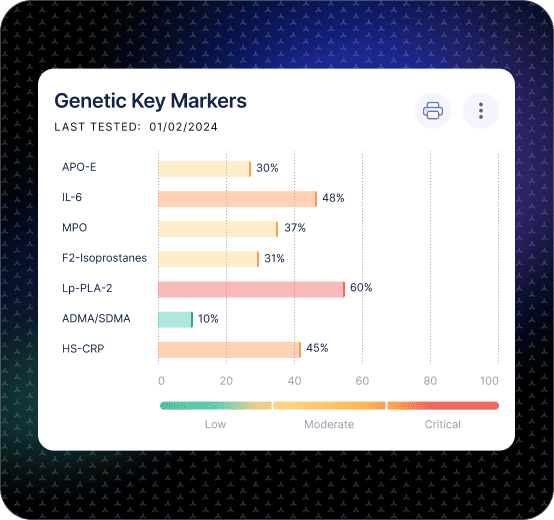
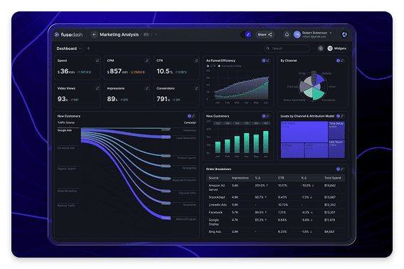
Operations Dashboard for Throughput and Cycle Time.

Track throughput, cycle time, WIP, and productivity in one operations KPI dashboard

Operations performance does not fail with one big number. It fails in flow: work piles up in one step, cycle time stretches, and the backlog becomes normal until customers feel it. Fusedash generates an operations dashboard that makes flow visible so teams can spot bottlenecks early, keep work moving, and improve process performance week after week.

fusedash/ag.drone
Daily Ops Review

What Your Operations Dashboard Should Reveal in the First 60 Seconds

The goal of an operations KPI dashboard is clarity during daily review. Your team sees where work is stuck, what changed since yesterday, and what lever will improve flow fastest. All of it in under 60 seconds.

Daily Ops Review

What Your Operations Dashboard Should Reveal in the First 60 Seconds

The goal of an operations KPI dashboard is clarity during daily review. Your team sees where work is stuck, what changed since yesterday, and what lever will improve flow fastest. All of it in under 60 seconds.

Where is WIP building, and which step is the constraint today?
Did throughput drop due to volume, staffing, downtime, or rework?
Is cycle time rising across the process or only in one stage?
Which teams or shifts are drifting from baseline performance?
Are we improving flow or just moving delays from one step to another?
What should we do next: rebalance capacity, remove blockers, or change the process?
Operations Dashboard Views

The Operations Dashboard Views Teams Actually Run Every Week

Ops teams need stable views that support daily review, bottleneck diagnosis, and improvement tracking. Not more metrics. Four views cover the full process performance cycle.

Operations Dashboard Views

The Operations Dashboard Views Teams Actually Run Every Week

Ops teams need stable views that support daily review, bottleneck diagnosis, and improvement tracking. Not more metrics. Four views cover the full process performance cycle.

Insights-Driven Platform
Daily Ops Review

Throughput dashboard (flow and volume)

See volume completed, backlog movement, and where work is accumulating so the team can act before delays compound.

Bottleneck Diagnosis

Cycle time dashboard (step-by-step)

Track cycle time across process stages and isolate which step is extending lead time and why.

Efficiency

Productivity dashboard (capacity and output)

Compare output vs capacity by team or shift to understand whether performance changes are staffing, demand, or process-driven.

Improvement Tracking

Continuous improvement dashboard (before vs after)

Track changes to processes and measure whether improvements reduced cycle time, lowered WIP, or increased throughput over time.

Getting Started

How to Generate an Operations Dashboard in Fusedash

Start with the flow metrics that explain bottlenecks. Then add drilldowns that match how your team reviews work: by step, team, shift, and work type.

Getting Started

How to Generate an Operations Dashboard in Fusedash

Start with the flow metrics that explain bottlenecks. Then add drilldowns that match how your team reviews work: by step, team, shift, and work type.

Insights-Driven Platform
01

Connect work intake and completion data

Import or connect data that reflects your workflow: tickets, tasks, orders, work items, timestamps, and status changes.

02

Define stages so cycle time is comparable

Align the process stages used by teams so cycle time and WIP mean the same thing across the whole operation.

03

Create a daily ops view first

Create operations dashboards teams actually use: flow clarity, drill-downs, and a shared view for daily review and improvement tracking.

04

Add drilldowns that point to action

Filters for team, step, shift, work type, and timeframe make it easy to isolate the constraint and assign an owner.

Fusedash Builder

Build operations dashboards teams actually use: flow clarity, drill-downs, and a shared view for daily review and improvement tracking.

Start a free trial

Operations KPIs to Track First

Operations dashboards work best when they measure flow, not vanity activity. Start with these four, then break them down by process step, team, and shift to find the real constraint.

Throughput completed per day or shift
Cycle time trend from start to finish
WIP volume and queue time by process step
Rework rate or blocked work trend when available

Choose the right dashboard for your team

Operations and logistics often get mixed together, but the questions are different. Use the dashboard that matches the decisions your team needs to make.

Operations dashboard for throughput, cycle time, WIP, productivity, and bottlenecks
Logistics dashboard for fulfillment, inventory, delivery performance, and SLAs
Use operations views to improve flow inside the process
Use logistics views to monitor execution across warehouses and delivery networks

Bottlenecks You Can Fix, Not Just Observe

A cycle time dashboard should do more than show a slow trend. It should show where work queues form and what changed so the team can remove the constraint quickly.

Step-level cycle time and queue time to pinpoint the constraint
Breakdown by team and shift to separate demand vs capacity problems
Before-and-after comparisons to validate process changes
A simple view that makes ownership and next action clear

Real-Time Monitoring for Internal Operations

When work systems spike, small delays compound into a backlog fast. Real-time monitoring helps ops teams react while the issue is still recoverable.

Throughput drops that signal a process or system constraint
WIP spikes in a single step that predict cycle time increases
Blocked work surges after changes or outages
Backlog growth that needs immediate rebalancing
FAQs Section

Operations Dashboard FAQs

Common questions from operations teams building an operations dashboard, operations KPI dashboard, throughput dashboard, cycle time dashboard, or productivity dashboard for daily review and process improvement.

FAQs Section

Operations Dashboard FAQs

Common questions from operations teams building an operations dashboard, operations KPI dashboard, throughput dashboard, cycle time dashboard, or productivity dashboard for daily review and process improvement.

What is an operations dashboard?

An operations dashboard is a performance view that tracks how work moves through a process: throughput, cycle time, WIP, backlog aging, and productivity in one place. Unlike a general reporting view, an operations dashboard is built for daily review. Teams use it to answer three questions every shift: Is work moving at the right pace? Where is it slowing? What needs attention before a delay compounds? The most useful operations dashboards show step-level data so teams can isolate the constraint, not just observe that one exists. When structured around a fixed set of indicators reviewed on a daily cadence, it is also called an operations KPI dashboard.

What is a throughput dashboard?

A throughput dashboard is an operations performance view that shows how much work a team or process is completing over a given period: volume completed per day or shift, backlog movement, and where work is accumulating. The goal is to give operations managers visibility into whether flow is steady, accelerating, or slowing before a backlog builds. Throughput is the primary leading indicator of process health. When throughput drops, the cause is usually visible at the step level: a staffing gap, a system constraint, a rework loop, or a demand spike the process cannot absorb. The most useful throughput dashboards show completed volume alongside backlog aging and WIP by process step, so the team can distinguish between a temporary demand surge and a structural bottleneck that needs a process change.

What is a cycle time dashboard?

A cycle time dashboard is an operations performance view that tracks how long work takes to move through each stage of a process, from intake to completion, and identifies which specific step is extending total lead time. Where a throughput dashboard shows whether enough work is being completed, a cycle time dashboard shows where the slowdown is happening inside the process. The most useful cycle time dashboards show both end-to-end cycle time and step-level cycle time. This lets the team distinguish between a process that is slow overall and one that is fast everywhere except a single bottleneck step. When paired with WIP data by step, a cycle time dashboard shows not just how slow a step is but how much work is queuing there, which determines whether the fix is capacity, process redesign, or temporary rebalancing.

What is a productivity dashboard?

A productivity dashboard is an operations performance view that compares output against available capacity, by team, shift, or process unit, to understand whether performance changes are driven by staffing levels, demand volume, or process efficiency. Where a throughput dashboard shows total volume completed, a productivity dashboard goes one level deeper. It shows whether a drop in completed work happened because fewer people were available, because demand was lower than usual, or because the same team is producing less per hour or shift than baseline. The most useful productivity dashboards normalize output by capacity so teams can compare performance across shifts of different sizes, identify which teams or roles are consistently over or under baseline, and distinguish between a productivity problem and a staffing problem before making resourcing decisions.

What is WIP in operations?

WIP, or work-in-progress, is the volume of work items that have been started but not yet completed at any point in an operations process. In a service or production workflow, WIP accumulates when work arrives at a step faster than that step can complete it, creating a queue that extends cycle time for every item behind it. Tracking WIP by process step is one of the most important operations monitoring practices. A WIP spike in a single step is often the earliest visible signal that cycle time is about to increase across the whole process, before the slowdown shows up in completed output or delivery performance. An operations dashboard tracks WIP alongside throughput and cycle time so teams can spot the queue before it becomes a backlog, and intervene at the constraint step rather than reacting after results have already deteriorated.

Which KPIs matter most for a throughput dashboard and a cycle time dashboard?

For throughput, track completed units per day or week, output by team or line, and throughput by step to see where flow slows. For cycle time, track end-to-end cycle time plus step-level cycle time, then add WIP and backlog aging to explain why cycle time changed. If quality is part of ops, include rework rate or first-pass success so faster does not mean worse.

How do operations teams use an operations dashboard day to day?

Use it like a daily ops review screen: confirm output is pacing to plan, check whether cycle time is trending up, and identify the step creating the bottleneck. Then drill into the segment driving it (team, step, priority, product line) and assign one action: rebalance WIP, remove blockers, or adjust staffing for the next shift.

What is the difference between an operations dashboard and a logistics dashboard?

An operations dashboard focuses on internal process performance: throughput, cycle time, productivity, WIP, and bottlenecks. A logistics dashboard focuses on execution visibility across fulfillment, inventory, delivery performance, and SLAs. Use an operations dashboard when the question is how work moves through your process. Use a logistics dashboard when the question is how goods and orders move through your supply chain.

Ready to Generate an Operations Dashboard Your Team Uses Every Day?

Generate an operations dashboard that tracks throughput, cycle time, WIP, and bottlenecks in one consistent view. Daily review is faster. Constraints are visible before they compound. Every team works from the same numbers.