What Is Dashboard Software?
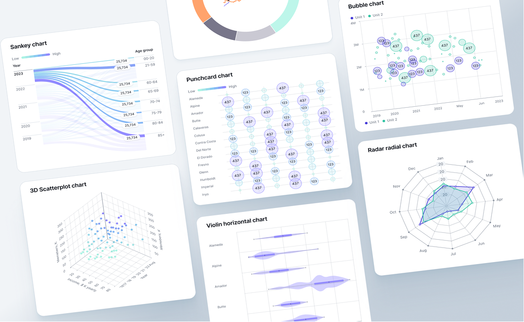
Dashboard software is an application that collects data from multiple sources and presents it in a visual format within a single interface. These visuals can take many forms, ranging from charts and line graphs to tables and intricate 3D visualizations.
Dashboards have become popular because businesses rely on multiple data points to evaluate performance, and analyzing them helps improve efficiency. An interactive dashboard supports this by extracting key metrics from large data sets. With effective KPI tracking, you can gain insights that help forecast outcomes such as growth, efficiency, profitability, and about a thousand other outcomes, depending on the user's needs.
What dashboard software does?
At a practical level, dashboard software works in three stages: data collection, data presentation, and data analysis.
First, it extracts data from multiple internal and external sources and presents it in a single view. These can include operational databases, CRM systems, internal reporting tools, and external sources such as social platforms, partner systems, and payment gateways.
The collected data is then analyzed and presented through charts, visuals, and comparison tables. That makes performance trends, such as cost movements, conversion rates, and target benchmarks, easier to identify, including how current results compare with past performance and competitors.
Next comes interactivity. Dashboard software allows teams to apply time-based, geographic, channel, or operational filters, while drilldowns enable deeper exploration of each metric. For example, you can click on total revenue and filter it by region, city, store, or even individual customers. Multi-dimensional filters support more complex analysis, such as evaluating product popularity across regions and time periods.
Dashboard vs report vs spreadsheet
Don’t think of a dashboard as a one-size-fits-all application. It isn’t. A dashboard gives you a visual summary of what is happening right now, and comparing this to what happened yesterday and possibly last year at this exact time. A report is meant to explore a specific outcome in depth, explaining the why behind the what. A spreadsheet, meanwhile, is designed for data entry, calculations, and hands-on manipulation. Oh, and by the way, the entire world hates reviewing spreadsheets.
When a spreadsheet is enough
A spreadsheet gives you a flexible, row-by-row workspace where you can store data, run calculations, and make manual changes. It works best when the dataset is small, and the task is temporary or exploratory.
For example, if you want to calculate last year’s shipment details for a small business and the task is short-term and calculation-heavy, using a spreadsheet is probably enough. You need control, not automation. Just keep the aspirin by your side.
When a dashboard wins
If you want to monitor business performance on an ongoing basis, spot anomalies, or keep an eye on key metrics so you can act quickly, a dashboard is the choice for those who want to stay ahead of the competition or the market.
Trends and comparisons matter here, and a dashboard lets you see what is changing in real time without pulling reports or asking analysts for constant updates. For example, when an operations team tracks total items delivered and compares performance against yesterday’s numbers, a dashboard simplifies the view.
When you need a report or narrative
The data that a spreadsheet delivers is raw, and a dashboard, while filtered, often lacks context. That’s where reports come into play.
Reports bring together data and reasoning, the what and the why. Stakeholders want information they can work with, not numbers they have to decipher.
For example, at month-end, when stakeholders ask for a performance review, dashboard screenshots or Excel exports fall short in terms of total details and narrative. What’s needed is an explanation of why the data looks the way it does. In other words, you need a report.
That said, at Fusedash, we also offer dashboard reporting tools that support story formulation.
Common dashboard use cases by team
Let’s take a closer look at some of the most common dashboard use cases across organizations.
Marketing performance
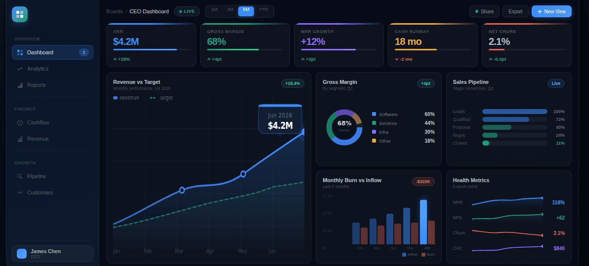
You may want to track the performance of your marketing efforts. The KPI dashboard reveals key metrics, including traffic volume by channel, conversion rates, cost per acquisition, and trend comparisons between current and past performance.
Data from ad platforms, web analytics tools, CRMs, and lead management systems comes together in one view. It allows you to see which campaigns are working, which ones to scale back, and where budget reallocation or ROI optimization is needed.
Finance reporting
Dashboards are equally valuable for financial reporting. By pulling data from accounting systems, ERPs, billing platforms, and payment processors, you gain a bird’s-eye view of margins, cash flow, budgets, and overall financial health.
Charts and graphs highlight period-over-period changes, while tables reveal cost structures and profitability. Filters and drilldowns help identify financial risks, track variances, and support individual or custom revenue forecasting and control depending on the particular user’s needs at that moment.
Operations monitoring
When you are monitoring day-to-day operations, dashboard software surfaces metrics such as order or task volumes, process cycle times, bottlenecks, SLA adherence, and exception rates. Delay and error metrics also become visible as data is pulled from internal systems like order management platforms, production systems, logistics or fulfilment tools, and internal monitoring software.
This visibility helps teams understand where work slows down, where handoffs break, and which parts of the system are under strain. Decisions around resource allocation, including staffing and operational spend, are often based on these signals. The same data also allows teams to address small issues early, before they compound into larger operational failures.
Leadership reviews
Is your business heading in the right direction? Leadership reviews are also possible through dashboard tools. By pulling together data from marketing, finance, and operations, a business insights dashboard gives you visibility into core KPIs across departments, trend summaries, target versus actual performance, and potential risk indicators.
Because this information is simple to understand, decision-making becomes easier. It also becomes easier to hold personnel accountable, identify areas that require improvement, and spot systems that may pose risks. In other words, it helps C-suite executives sleep at night.
Features that matter in dashboard software
Luzmo reveals a surprising statistic that 43% of SaaS professionals believe dashboards are old-school and on their way out, while 41% believe the opposite. Here at Fusedash, we believe that this split does not reflect a lack of interest in dashboards themselves, but rather a lack of focus or understanding of the features that actually matter.
KPI cards, charts, tables
With KPI cards, you get individual metrics in a compact, readable format. Charts allow you to visualize data, such as comparing current performance with past results. Tables provide row-level data for verification and accuracy, making them suitable for those who need to work closely with raw numbers.
These different formats serve different users. Analysts often use charts to identify trends, while tables are useful for end users who need to validate data or correct inconsistencies.
Filters, drilldowns, segments
Filters are critical features that let you narrow the data you see based on time range, region, channel, cost, or other dimensions. Drilldowns put a particular metric under the microscope, while segments help categorize data into meaningful groups.
These features matter because they enable what analysis actually requires: exploration. When decisions need to be made quickly, your team must move beyond surface-level information and drill deeper to understand what is really driving the numbers.
Sharing and stakeholder access
Sharing data across users at different levels is critical. Internal teams may need access to detailed, backend analysis, while stakeholders often require visibility into key KPI metrics. Partners or clients may also need access, but only to information relevant to them.
If access controls are weak, accidental edits become more likely, sensitive information can reach the wrong people, and confusion can spread across teams. With proper access controls, responsibilities are clear, and data is shared safely and intentionally.
Governance and metric definitions
Governance defines the rules for creating, managing, and maintaining metrics. Through governance, KPIs remain consistent, following the same formulas, naming conventions, and ownership rules across all dashboard users.
Without proper governance, teams may rely on incorrect calculations or conflicting metrics, causing dashboards to contradict each other and eroding trust in the data. On the other hand, strong governance saves time by removing the need to constantly reconcile numbers across teams.
Refresh and real-time
Refresh refers to how often dashboard data is updated. Updates can be scheduled at fixed intervals or refreshed in near real-time.
However, it is not always the case that “the fresher the data, the better the decision.” Operational teams often need near real-time data to function smoothly, while finance teams and those focused on strategic reporting can work effectively with data that updates less frequently.
Dashboard software buying checklist
With a dashboard, you are not looking for a short-term solution. It is a long-term application that will shape how your business uses data. With this in mind, here are the key questions you should ask before choosing a platform.
What data sources does the dashboard connect to out of the box?
Find out whether the dashboard relies only on internal systems or also supports third-party sources. You should also ask how these connections are maintained over time.
How are KPIs defined and governed across dashboards?
Ask about the rules used to define KPIs and the steps taken to maintain consistent metric governance across the platform.
How frequently is the data refreshed?
As mentioned earlier, data freshness matters, but fresher is not always better. If you are dealing with operational systems, ask whether real-time refresh is supported. For financial or strategic reporting, a slower refresh rate may be acceptable.
Who is the dashboard builder, and who can only view the dashboards?
Ask whether role-based access is available and whether non-technical users can safely view and interact with data without risking accidental changes.
How does the platform handle scale?
Ask whether the platform can handle higher data volumes, increased user counts, and performance demands as your business grows.
Based on the questions above, here are the must-haves in any dashboard:
- Connects to required data sources without heavy or time-draining setups
- Supports KPI cards, charts, and tables in a single dashboard
- Allows filtering, drilldowns, and basic segmentation
- Enables role-based access and safe sharing with stakeholders
- Maintains consistent KPI definitions across dashboards
- Provides clear data refresh schedules and update visibility
- Performs reliably as data volume and user count grow
- Is usable by non-technical teams without constant support or extensive training