How to Build a KPI Dashboard That Drives Decisions
Many businesses rely on KPIs to assess their performance and guide their decisions. Tracking the data, however, isn’t straightforward. Surface-level, popular metrics often take center stage, which represents only a tiny portion of the capacity a KPI dashboard can deliver.
According to industry research, 72% of companies don’t properly track their KPIs. The issue lies in not being fully decision-oriented. An effective dashboard focuses not only on the right metrics, but also on the right definition, layout, and review cadence. Therefore, at Fusedash, our goal is to help our clients design precise dashboards that simplify data understanding and enforce strong decision-making.
Start with the decision, not the data.
Your business outcome should determine the data required, not the other way round. For instance, if you are running a SaaS business, then it is easy to believe that “website traffic” is a good metric to follow, but if the traffic goes down, it won’t explain why.
Unlike a traditional metrics dashboard, a KPI dashboard uses a decision-first layout to guide action rather than just display numbers.
Therefore, define business goals first. Then select the drivers that help you reach them before establishing guardrails - the constraints. The goal gives you vision, the drivers give you the data points to follow, and the guardrails prevent you from taking unnecessary risks that can degrade your business.
The “decision statement” template
Create a decision statement that establishes the core philosophy for your KPI dashboard template. The statement is a short sentence that defines what the dashboard must do. If a KPI does not support the statement, it does not belong on the dashboard.
The template looks like this:
When [situation or review cadence],
I need to decide whether to [action],
to achieve [business outcome],
while ensuring [guardrails are not violated].
Suppose your focus is on operations, then the decision statement becomes.
When reviewing the daily operation, I need to decide whether to add temporary staffing to achieve timely orders while ensuring that error rates and overtime hours remain low.
Choose the right KPIs
Creating a decision template means establishing a framework for your KPI dashboard. The next step is selecting the right KPIs.
Outcomes vs. drivers vs. guardrails
- Outcome KPIs answer: what success looks like. They measure the result of your business efforts. Customer retention rate, net revenue retention, and monthly recurring revenue are examples of outcome KPIs. While essential, these KPIs are not actionable.
- Driver KPIs answer: What actions should be taken to achieve a certain result? They are the levers that decide a business outcome. Leading indicators include throughput, sales conversion rate, average order value (AOV), and lead response time. These are the KPIs that teams can take immediate action upon.
- Guardrail KPIs answer the question: What actions must stay within bounds? They ensure that actions driven by KPIs do not introduce unacceptable risk or cause damage elsewhere in the business. Metrics such as service reliability, complaint rates, audit findings, and safety incidents commonly serve as guardrails.
Leading vs lagging indicators
- Leading indicators answer: What will likely happen if the current pattern continues? Their purpose is to predict trends in finances, industry, competitors, and your own department based on current performance patterns. Examples include cart abandonment rate, checkout completion rate, and average delivery delay rate.
- Lagging indicators answer: What has happened already? Monthly profit, churn, revenue, and customer satisfaction rate all come under lagging indicators. Their purpose is to create reports and establish an ongoing form of accountability.
Define every KPI, so teams agree
A KPI can only work as intended if all teams interpret it the same way.
Take Customer Acquisition Costs (CAC), for instance. If the performance dashboard shows that the CAC trendline is rising, the marketing team may interpret it as a sign that their ad campaigns are becoming inefficient. In contrast, the sales team may see it as the arrival of enterprise-level customers.
Same indicator, different conclusion. Result? Operational dissonance due to confusion. Therefore, define each KPI clearly so the team spends less time debating data definitions.
KPI definition template (name, formula, grain, owner)
Name
Name the KPI in a decision-oriented, non-ambiguous manner. Focus on describing what is being measured, not how the calculation is being done.
For example, instead of using a vague term like “Customer Acquisition Cost,” use something more precise, such as “Customer Acquisition Cost for Paid Channels,” to ensure marketing and sales teams aren’t interpreting the data differently.
Formula
Define a precise formula for calculating the KPI. Include the inclusions, exclusions, and edge cases. It is an important factor in establishing trust in the data.
For example, CAC is calculated using the formula: Total sales and marketing spend ÷ number of new paying customers acquired in the period. This formula makes it clear to the team which customers and which costs to include.
Grain
With a grain, you describe the level at which you are measuring the KPI. In simple terms, it establishes the “per the numbers” part. For instance, the indicator can be measured per day, per order, per customer, or per account.For example, choose “CAC per month” instead of relying on the average CAC. Adding the “per
month” grain makes it easier for teams to spot inefficiencies.
Owner
The KPI owner maintains the KPI definition, validates the data, and answers questions when issues arise.
For example, CAC may be owned by Revenue Operations or Growth Analytics, making the team aware of the source of truth for how the metric is defined and interpreted.
KPI dashboard layout blueprint
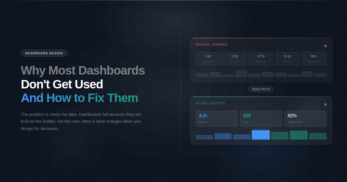
Eye tracking and UX research have shown time and time again that human attention follows a predictable pattern, top to bottom. It is akin to a classic marketing funnel. The top row answers what is happening right now. The middle row shows how the data changes over time. The final row goes deeper, answering why the data is behaving the way it is.
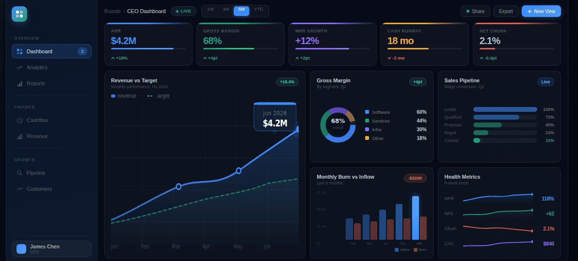
Top row: KPI cards
As already highlighted, the eyes meet the top row first. Therefore, KPI cards reserve that spot, answering: Is performance on track? It is the area where the viewer seeks clear numbers or directional indicators that help capture information without deciphering it.
This layer gives viewers initial context.
Middle: trends over time
After the top row gives clarity about where things stand, the middle row informs the user about what data is changing. The middle row is where trends belong.
Trends provide temporal reasoning, as people find it easier to interpret patterns than numbers. Placing charts in the middle prompts viewers to look for momentum and identify inflection points without examining raw data.
This layer provides information to support proactive decision-making.
Bottom: breakdowns and tables
The final row clarifies why the data is behaving the way it is.
Viewers get breakdowns, segmented views, and tables in the bottom row. More cognitive effort is required in this region, as it enables comparison, filtering, and interpretation of the data.
This layer offers evidence to support the data, enabling analysis, validation, and data storytelling that explains why performance changed and what should happen next.
Add filters and drilldowns without clutter
The KPI dashboard will present all the data; now it is up to the viewer to get the information they want. To enable that, Fusedash recommends adding filters and drilldowns, but without clutter.
Recommended filters
Since the goal of filters is to make things simple and make appropriate information clearly visible, you should implement the following core filters in the dashboard:
- Time: The most critical filter, time lets you shift between daily, weekly, monthly, quarterly, and even custom ranges to understand short and long-term trend fluctuations.
- Geography: Multi-location businesses should rely on geography filters to let teams compare performance across regions, countries, cities, and territories.
- Channel: Marketing teams need to understand how performance varies across acquisition channels, sales sources, and traffic origins, which the Channel filter is for.
- Customer/Segment: Teams can identify customer type, account tier, industry, and persona using the Customer or Segment filter.
- Product / Service: This filter provides a view segmented by performance, by product line, SKU, or service category, to help identify growth drivers, underperforming segments, and cross-sell opportunities.
- Team/Owner: Accountability and performance are enforced through this filter, which allows viewers to check KPIs by department, team, region owner, or operational owner.
Drilldown structure
Drilldowns will help your team move from high-level signals to root cause analysis. A clear drilldown provides a logical path for faster decision-making.
Here is a progressive narrowing model to follow:
Aggregate > segment > unit > record
Begin with aggregate metrics, such as total revenue, total orders, or overall conversion rate, before drilling down into segments such as region, channel, product, or customer type. Go deeper into individual units, like stores, campaigns, accounts, or SKUs, before reaching the record-level data, including individual transactions, orders, or customer interactions.
Set a review cadence
Review cadence ensures the right teams review the right details at the right time, so you can take the right action. If there is no established cadence, there is only noise. Teams may overreact if they check the dashboard too much, and when they don’t do it enough, some key details could be missed. This can be the kiss of death for a well-functioning team, but finding the right balance can be a critical element in a successful team structure.
Daily checks
Daily checks are for operational awareness. They monitor the running systems and ensure fluctuations don’t exceed acceptable limits. Daily checks focus on outcome and guardrail KPIs, keeping tabs on uptime, SLA breaches, or error rates.
Weekly review
Weekly reviews focus on recognizing patterns. Teams look for consistent trends, spot emerging risks, and identify early signals that performance is drifting. Weekly reviews are therefore done for driver KPIs.
Monthly review
Monthly reviews are typically driven by an executive KPI dashboard, where outcome KPIs, trends, and guardrails are reviewed together to assess direction, accountability, and risk.
KPI dashboard checklist
- Start with a clear decision statement
- Choose KPIs based on outcomes, drivers, and guardrails
- Balance leading and lagging indicators
- Define each KPI with name, formula, grain, and owner
- Place outcome KPIs as top-row KPI cards
- Show trends over time in the middle row
- Use tables and breakdowns only for deeper analysis
- Add only decision-relevant filters
- Design drilldowns from aggregate to record level
- Assign clear KPI and dashboard ownership
- Set a daily, weekly, and monthly review cadence
- Ensure the dashboard is understandable at a glance