.png)
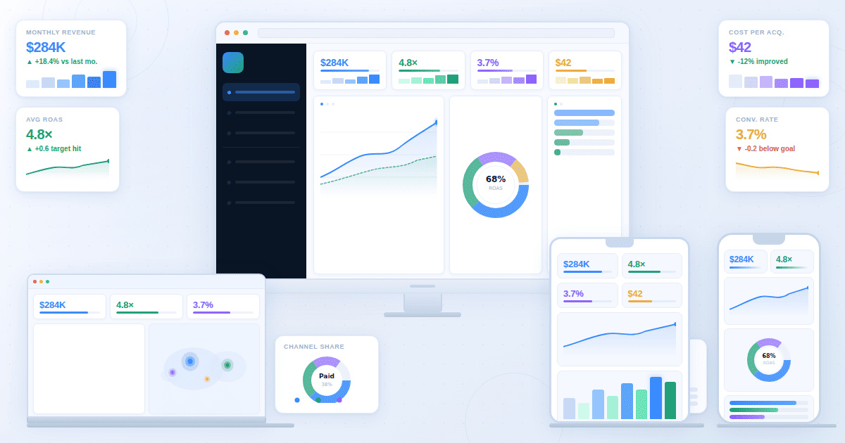
SaaS Dashboard KPIs
You set up a company, and your plan is to expand, to grow, and get more customers. Where do you start? You know that there is a bunch of data you need to track via your dashboard, but which ones should you actually care about?
SaaS Dashboard KPIs are those data points. Unfortunately, many businesses either ignore them or don't implement them properly. In fact, a BARC survey found that while 79% of organizations have a defined set of KPIs, only 36% use them pervasively across the organization.
The reason: an abundance of information without any direction. When every indicator on the product metrics dashboard feels important, it is easy to get lost in the sea of details that ultimately derail an organization from its business goals.
The purpose of this article is to highlight the key elements of a SaaS metrics dashboard. You will learn which KPIs matter, why, and how to present them.
SaaS KPI map: outcomes, drivers, guardrails
The SaaS KPI map is a three-tier structure that establishes the roadmap you must follow to achieve positive results for your company.
At the top are the outcomes. They measure what your SaaS business wants to achieve, indicating whether it is healthy. Drivers are in the middle, tracking indicators that help achieve those outcomes.
Companies may optimize these KPIs haphazardly, creating clashes that can enhance one outcome but break another.
Preventing that from happening are guardrails, tier-3 KPIs that establish limiters so that all outcomes move in a positive direction.
Outcome: Net revenue retention, growth
Outcome is the guiding light of your business, telling you whether it is healthy and growing. Two SaaS dashboard KPIs that come in the lead when it comes to giving you insight into outcomes are Net Revenue Retention (NRR) and Annual Recurring Revenue (ARR).
Net Revenue Retention (NRR)
NRR measures how much revenue you have retained from existing customers within a period of time (generally 12 months), which is almost every company on earth struggles with. It includes expansion (upgrading services or adding more seats) and contraction (cancelling services or downgrading). It does not include new Logo (also known as a new customers or a new contract). NRR is widely regarded as the single most important SaaS health metric by leading investors.
Here is the formula: (Starting MRR + Expansion MRR - Contraction MRR - Churn MRR) / Starting MRR × 100
Getting 100% means your business is stable. Getting more than 100% means your business is achieving growth even without acquiring new customers.
Annual Recurring Revenue (ARR)
ARR is another outcome marker, telling you the rate of your business's growth. NRR tells you the quality of growth, while ARR tells you the quantity. Pairing both will tell you whether the business is growing sustainably.
For instance, if your company's ARR growth is 45% while NRR is 90%, it means there is a retention issue hiding underneath, and fixing it will allow you to grow even faster.
Drivers: activation, expansion
If the outcome is the north star, drivers are the engines that help you reach it.
Activation
Activation rate is a KPI that tracks when new customers experience the core value moment of the product.
Suppose you are running a messenger app specializing in emojis. One day, a customer starts using them to craft unique messages that they would not create anywhere else. This is the "aha moment" for the customer, forming the base for long-term retention.
However, if the core value is not reached quickly, the activation rate drops.
Without activation, there is no retention. Without retention, there is no expansion. Without expansion, NRR becomes either stagnant or falls below 100%.
Expansion
Expansion is another NRR feeder. It is a lever that includes additional features, plan upgrades, usage-based overages, cross-sells, or seat growth.
Suppose the same messaging app introduces a package of new emojis, and the same customer purchases it. Revenue growth happens without needing new customers.
Such levers keep the expansion motion going, helping companies hit their ARR targets. A capital-efficient way to grow a business, expansion saves costs on customer acquisition.
Guardrails: churn, CAC payback
Focus too much on one driver, and you will end up overoptimizing it while damaging another. Guardrails prevent that. Here are the two KPIs to track.
Churn
Your business may be growing too aggressively while losing old clients. For instance, you may introduce new features that your existing customers are not fans of, while newcomers are curious about them.
The churn dashboard will show a graph where the churn rate of both logo churn (customers cancelling) and revenue churn (revenue going down) is rising, but activation and expansion look healthy.
Such a graph indicates that you are getting the wrong kind of customers, ones that are only curious today but will not stick for the long term. Not accounting for churn rate could push NRR below 100%, as aggressive growth is often followed by an aggressive fall.
CAC Payback
Acquiring new customers costs money. How long does it take to recover? That is the essence of what the CAC payback period is.
For small-level SaaS, under 12 months is strong. 18 months is acceptable for mid-level firms. However, if it takes more than 24 months, it is alarming.
Establishing CAC payback as a guardrail prevents teams from overinvesting in new customers that look good volume-wise but are not engaging with the product much.
Revenue KPIs (MRR and beyond)
Revenue KPIs are a mix of outcome and driver indicators, providing direction to the business and measuring the efficiency with which the business is moving in that direction.
New, expansion, contraction, churn MRR
The key revenue KPI is MRR or Monthly Recurring Revenue. However, the MRR dashboard does not show it as a single number since it is the result of five moving components that combine to form the MRR waterfall.
- New MRR: Revenue from new customers who signed up this month for the first time. A visible number to most teams, it is also the most expensive to generate due to the money spent on acquiring new customers.
- Expansion MRR: It indicates additional revenue from existing customers. Customers have upgraded their plans, paid for more usage, or added more seats. All of that comes under expansion MRR.
- Contraction MRR: Customers who downgrade plans, reduce seats, or cut spending trigger contraction MRR.
- Churn MRR: This is the revenue lost from customers who have cancelled their plans entirely. It is also the most visible element of revenue loss.
- Reactivation MRR: This indicates the revenue from those who cancelled but later returned. While most companies do not track it separately, they should, since bringing old customers back costs less than finding new ones.
- Net New MRR: It is calculated using the formula: New MRR + Expansion MRR + Reactivation MRR - (Contraction MRR + Churn MRR). It is a single number representing whether your company's MRR grew or shrank last month.
Churn and retention KPIs
Churn and retention KPIs tell you three things:
- Is your product delivering value?
- Is your business structurally vulnerable?
- Is growth happening sustainably?
The following KPIs, together and separately, give answers to these questions:
Logo vs revenue churn
Logo churn indicates the percentage of customers who have cancelled with respect to the total customer base. Revenue churn tells the monthly recurring revenue lost due to cancellations and downgrades.
For logo churn, the formula is: Customers Churned / Total Customers at Start of Period × 100.
For revenue churn, the formula is: MRR Lost / Total MRR at Start of Period × 100.
Keeping tabs on both in the retention dashboard is important because not all customers are equal. A high logo churn but low revenue churn indicates that weaker customers have left while stronger ones remain.
On the other hand, if revenue churn is rising faster than logo churn, the issue is deeper. It means your largest accounts are churning, indicating that your product is not meeting market needs at an enterprise level.
According to ChartMogul SaaS Churn Benchmarks data, healthy monthly logo churn benchmarks are 2% for SMB, 1% for mid-market, and 0.5% for enterprise.
Cohorts
A cohort dashboard tracks a group of customers who started at the same time, typically within the same month. It monitors these cohorts to see how many remain active after 1, 3, 6, 12, and 24 months.
Cohort analysis offers deeper insight than aggregate churn numbers as it reveals patterns, (something dashboards are incredibly good and providing) about when customers are most vulnerable and whether retention is improving or deteriorating.
- A healthy cohort curve shows a drop in the first 1 to 3 months before flattening, indicating customers have found their footing within the product.
- An unhealthy cohort curve keeps falling without flattening, indicating a product value problem that gives customers reasons to leave at every stage.
Activation and usage KPIs
Between acquisition and retention sit activation and usage KPIs. They answer one question:
- Are customers actually getting value from the product after signing up?
SMB SaaS businesses often ignore these KPIs, not knowing that they are critical to positive business outcomes.
Funnel and Time-to-value
Start with the funnel metrics:
- Sign up to onboarding completion rate: Shows how many signups were followed by onboarding completion.
- Onboarding to first key action: Shows how many among the onboarded acted meaningful to the product.
- First action to activation: Shows how many among those who took the first key action reached the core value moment.
Improving one leads to improvement in the overall activation rate.
The way to improve activation rate is through Time to Value (TTV):
Time to Value (TTV) is the time taken by a new customer to reach the core product value moment. Shorter TTV means better retention.
To improve TTV, reduce friction between the product and the user. Make the UI simpler, interactions error-free, and product value clearer.
Expansion and Retention Signals
Adoption and Stickiness
- Feature Adoption Rate: It shows the percentage of users actively using a specific feature. It helps separate features that customers actually find valuable from those that they do not. Customers are willing to pay more for valuable features to get deeper access. Low adoption means the feature cannot drive expansion.
- Product Stickiness: Measured in terms of daily active users or monthly active users, it shows whether customers engage with the product regularly. Regular users are more likely to expand and less likely to churn.
Dashboard layout blueprint
Presenting the right numbers to the right audience is only half the job. Turning those numbers into a narrative that drives decisions is the other half.
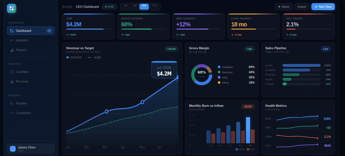
Exec View
Meant for executives, founders, VCs, and board members. It can be shown monthly or weekly.
To include: ARR, MRR growth, NRR, logo churn, and CAC payback. To exclude: Feature adoption rates, funnel drop-off, and session frequency.
Layout:
- Top Row: 4-5 headline numbers with trend vs prior period
- Second Row: MRR waterfall for the month
- Third Row: NRR trend over the last 12 months
Growth View
Meant for sales leads, marketing leads, and revenue operations. It can be shown weekly.
To include: New MRR by channel, expansion MRR, CAC by channel, activation rate by source. To exclude: Feature adoption heatmaps, cohort curves, and health score distribution.
Layout:
- Top Row: New MRR, expansion MRR, and net new MRR
- Second Row: New MRR broken down by channel
- Third Row: CAC by channel and volume
- Fourth Row: Flagged accounts with low activation rates by acquisition source
Product View
Meant for product managers, product leads, and engineering leadership. It can be shown daily or weekly, depending on release cycles.
To include: DAU/MAU, activation rate, TTV, feature adoption by segment, and health score distribution.
To exclude: ARR, CAC payback, burn multiple.
Layout:
- Top Row: DAU/MAU, activation rate, and average TTV with trend vs prior period
- Second Row: Feature adoption heatmap across the customer base
- Third Row: Cohort retention curves for the last 6 months
- Fourth Row: Flagged customers whose health scores dropped significantly that week
Weekly review template
Once you have the numbers, it is time to use them to make decisions. That is where the weekly review comes in.
A simple template lasting only 25 minutes is enough to inform all key decision makers, from founders to growth leads, to take action.
Opening (5 min)
- What moved significantly this week?
- Are we on track for month-end MRR?
- Any churn or expansion surprises?
Deep Dive (15 min): Rotate weekly:
- Week 1: Acquisition: Where did the new MRR come from?
- Week 2: Activation: Where are users dropping off?
- Week 3: Retention: Which segments are churning?
- Week 4: Expansion: Who expanded and what triggered it?
Closing (5 min)
- Which metric is most at risk right now?
- What are we doing to move it, and who owns it?
Turn KPIs into a Weekly Review