Real-Time KPI Dashboard Guide
A real-time KPI dashboard tracks the business metrics that change constantly, from website traffic to checkout conversion to uptime. Because the information on these dashboards is updated in seconds, it helps your team detect issues early and stay operationally aligned.
Yet, according to Parable Associates, over 90% of dashboards go unused within six months, largely because the wrong KPIs are selected. As the saying goes, we don’t know what we don’t know.
This article clarifies which metrics deserve live monitoring and which do not.
The rule of live KPIs
“Track what helps you predict the next outcome to make your next move.”
That is the core rule for live KPIs. Focus on leading indicators, the metrics that move first and signal what is likely to happen next. They exist for preventive purposes, and not necessarily for reporting.
Tracking revenue live rarely helps because it is a lagging indicator. Instead, monitor the signals that influence revenue, like product returns.
Website traffic can help predict demo bookings and sales call volume. Add-to-cart rate can signal upcoming purchases and inventory pressure.
What to Track Live By Team
Now that you know that leading indicators are the focus, it is time to learn which indicators should be added to the real-time interface:
Marketing Pacing KPIs
These are leading indicators that show whether campaigns are on track to prevent budget waste by answering the following question:
“Is the company’s marketing-spend achieving timely results?”
Here are the critical KPIs focused on marketing pacing:
Spend vs. Budget Pacing
Most people know that budgets can burn too fast if not tracked properly. Campaigns can shut down mid-month, which may leave no money for high-performing periods.
Therefore, track spend vs. budget pacing to prevent budget leakage by getting the answer to the following:
“How much of the allocated budget has been spent within the allotted time?”
Click Through Rate
What if an advertisement is not getting clicks? Is the team suffering from creative fatigue?
Click-through rate answers these questions. It helps gauge creative fatigue in teams by using engagement as the barometer for content quality.
Conversion Rate
Without monitoring conversion rate, your team may ignore checkout bugs. Realization may come too late that paid traffic is sending visitors to a failing funnel.
Conversion rate answers, “Is the page alright, or is there friction in the system?”
E-commerce Checkout and Revenue Health
Beyond marketing, the next key process step is the transaction layer. This layer shows whether successful marketing is actually funneling into functioning systems.
For instance, even if the conversion rate is high, it only turns into profit when customers are able to complete their purchases without friction. If checkout systems, payment gateways, or pricing logic fail, marketing performance becomes irrelevant, or at least much less in need of updating, as you now have other priorities.
E-commerce checkout and revenue health form the core of this transaction layer, consisting of the following KPIs:
Checkout Conversion Rate
During busy sales periods, small checkout issues can go unnoticed for hours unless they are tracked with some kind of live monitoring system. The impact of this negligence becomes clear when looking at data from the Baymard Institute, which reports average cart abandonment rates of around 70%. Even minor friction at checkout can compound quickly when traffic volume is high and really screw up your total sales numbers.
Checkout failure checkpoints can be monitored using a Checkout Conversion Rate. Checkout Conversion Rate is the percentage of users who complete checkout after initiating it. Tracking it live helps identify technical errors, payment issues, or UX friction before they start having a big impact on your revenue.
Payment Failure Rate
Payment instability is common in e-commerce during peak hours. Ignoring it could lead to irrecoverable revenue loss. Tracking payment failure rate live, however, helps you gauge gateway issues and bank declines as they happen in real-time - a significant cog in your sales wheel.
Since this metric is directly tied to cash flow protection, payment failure rate is perhaps the most important KPI in the transaction layer.
Average Order Value
Your revenue may look stable at first glance, but profitability may be declining underneath. Average order value shows rolling AOV for the last hour or a few hours, which helps determine whether margins are declining.
It tracks promo stacking, discount bugs, or pricing errors that can subtly distort your margins.
Ops Throughput and Cycle Time
Operational metrics are the heart of customer fulfillment. They highlight the roadblocks to customer satisfaction, and without repeat customers, your company will fail regardless of how great your product is.
Order Processing Backlog
One of the biggest issues that compounds delivery delays is orders stuck in the processing queue. As the backlog grows, dispatch timelines start slipping, and SLA commitments become harder to maintain.
Late deliveries are among the top drivers of negative e-commerce reviews. The order processing backlog is a metric that detects these delays early, allowing operations teams to step in and fix bottlenecks before customer dissatisfaction increases.
Average Fulfillment Time
When you promise to deliver, customers expect fulfillment within a due time. However, warehouse slowdowns often extend the time it takes for a confirmed order to be dispatched. This time is called the Average Fulfillment Time. Without tracking it, customers may not trust the “timely delivery” promise anymore.
Throughput Rate (Units per Hour)
Only assuming that operations are happening smoothly is a pipe dream. Without properly tracking throughput rate, you may not realize that backlogs are forming until it is too late.
It helps detect staffing bottlenecks and sudden drops in operational efficiency before they escalate into larger fulfillment delays.
Customer Support SLA signals
When a customer asks for an issue to be resolved, the solution should meet the requirements mentioned in the service level agreement (SLA). Tracking how issues are handled with respect to the SLA is done through customer support SLA signals.
Here are the three most prominent signals among them:
First Response Time (Rolling Window)
First response time is the time it takes for the business to respond to a customer’s complaint. The average response time varies based on the industry. However, according to the OS Ticket Forum, the average response time of 60 to 120 minutes could be considered a benchmark. If it is not tracked, teams can quickly become overwhelmed if support requests rise sharply, and end up having to pull resources from other departments.
This is a leading indicator that helps teams manage a slew of complaints while keeping customers satisfied.
Open Ticket Volume Spike
Open ticket volume shows a rapid increase in the number of unresolved customer complaints. Ignoring the metric may shift your attention away from the root problems in the operation. With it, however, you will get an early warning about systemic operational issues within the organization.
Escalation Rate
Not all issues can be resolved in one go. Some require higher-tier intervention. For instance, a deep software issue may require a support team to connect users to a software expert.
Escalation rate indicates the number of issues that require such intervention. It is tracked to gauge the ecosystem’s stability.
Thresholds and Alerts Basics
A monitoring dashboard has one purpose: to keep an eye on operational efficiency. It trains the mind to focus on unusual activity in the operation, or anything that is not part of the standard process.
Sometimes, however, this focus is intensified, turning every red signal into stress and every graph spike into anxiety.
The truth is not every red signal is a warning, and not every momentary spike dooms the business. To save yourself from such pitfalls, you need to learn the basics of alerts and thresholds.
Simple Threshold Rules
Real-time metrics become actionable simply by establishing simple thresholds. When setting thresholds, simply ask: At what point does the metric become an issue?
Think of the thresholds as boundaries that trigger attention when needed.
“For instance, if the red signal appears on a live KPI dashboard more than 5% of the time, it should set a trigger. If the first response time is more than 15 minutes, it should set a trigger. Similarly, if API uptime is less than 99%, it should set a trigger.”
The rules of thumb for simple thresholds are as follows:
- The limits must be predefined.
- These limits must be static.
- They must be easy to implement and communicate.
With good thresholds, you get actionable signals. But when they are bad, all you get is noise. Here are some additional tips to set good thresholds:
- Tie the threshold to how it impacts the business. If it looks innocuous now but can have a long-term negative impact, don’t ignore it.
- Tie the threshold to action ownership. If you can take action quickly and hold someone accountable, pick it.
- Do not be oversensitive. If you set the threshold to the minimum, you are just inviting anxiety, as the negative signals would appear often.
Baseline Comparisons
Simple thresholds are good for obvious errors. Such thresholds, however, cannot keep tabs on subtle errors that hide under a perfect system but do damage underneath.
For instance, what if the Cost Per Click (CPC) stays within the same range for a long time despite taking new marketing measures?
That’s where baseline comparisons step in. They use historical patterns to define normal behavior for the system, creating an anomaly detection dashboard.
“The alerts are more nuanced. For instance, where a standard alert would trigger when conversion falls below 2%, a nuanced alert may trigger when conversion falls 10% at a particular time of day.”
Thanks to baseline comparison, a real-time KPI dashboard can help you detect everything from abnormal claims to unusual patterns, and anything else you can think of to help you see inside your sales process.
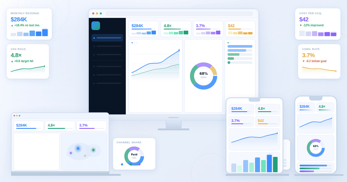
Layout for monitoring dashboards
Understand that real-time dashboards are passive, showing alerts for abnormal activity. Since providing “clarity at a glance” is the goal, the layout should focus on simplicity.
TV mode design
You don’t look at a real-time dashboard for deep analysis. You look at it for clear operational signals. If it is cluttered, confusion follows, and the monitoring fails.
A dashboard should be readable from a distance, making TV mode design optimal. Use large screens, large fonts, and no more than eight KPIs on screen.
Each KPI should use sharp visuals. Trends must be clear, colors high-contrast, and shapes large.
Minimal interaction
Pressures are high during operations, so operators need to make fast decisions. A dashboard that requires too many clicks slows response time and defeats its purpose.
In a real-time dashboard, excessive filters act as chokepoints rather than helpers. Minimal interaction should be the mantra. Data must be instantly visible, alerts immediately understandable, and auto-refresh built in.
What not to track live
In a world that increasingly values data-centricity, all information seems important, making it easier for businesses to get lost in the clutter.
Therefore, knowing what to track is important. It means ignoring all lagging KPIs and vanity metrics.
Below is a list of lagging and vanity metrics to ignore:
- Monthly Revenue: It changes too slowly.
- Quarterly Profit Margin: It shows operational outcomes.
- Total Followers: A vanity metric that can often be faked.
- Cumulative App Downloads: It always increases, so there is no point in tracking it live.
- Raw Page Views: Traffic alone does not highlight a website's health.
- Impressions (without engagement data): Only visibility, no impact.
- NPS Score: A periodic feedback metric.
- Monthly Churn Rate: Does not require real-time intervention.
- Customer Lifetime Value: A strategic metric recalculated over time.
- Year-over-Year Growth: A broad metric that indicates performance quality, not operations.
- Multi-Touch Attribution Models: Constant recalculation only creates noise.