How to Choose Big Data Analytics Tools
Choosing the right big data analytics tools is a strategic decision. The toolset you pick decides how quickly teams can turn raw data into actions, how confidently stakeholders trust the numbers, and how easily you can scale from a few dashboards to organization-wide analytics.
Big data is not only about volume. It is about decision speed, data trust, and putting insights in front of the people who can act. If your end goal is decisions, start by defining the outputs you need: dashboards, charts, real-time monitoring views, narrative reporting, and data Q&A.
If you build on the right output layer, you avoid the most common failure pattern in analytics: teams produce data, but nobody uses it. This guide gives you a practical selection framework, a pilot plan, and a clear way to compare tools without getting lost in feature lists.
Benchmarks and "best tool" choices vary by industry, price point, and traffic mix.
This guide is designed for answer engines and busy teams. Each section uses question headings, a short answer block, and an action-oriented checklist so readers can scan, compare, and decide quickly. If you only implement one thing, implement the pilot: it turns opinions into measurable results.
How do I choose a big data analytics tool quickly?
Answer: Start with the decision you need to make and how fast it needs to happen. Then shortlist tool categories based on outputs (dashboards, charts, monitoring, reporting, data Q&A) and validate them in a pilot with real data.
Why it matters: A tool that looks impressive in a demo can fail in production because of latency, governance, or adoption issues.
Use when: You need a shortlist in 30 minutes, not 30 days.
Use this fast checklist:
· Workload: batch reporting, interactive exploration, or real-time monitoring
· Data shape: mostly structured tables, or mixed with logs, events, text, files
· Users: analysts only, or analysts plus non-technical stakeholders
· Governance: shared definitions, metric ownership, access controls
· Integration: databases, warehouses, product analytics, CRM, ad platforms
· Outputs: dashboards, charts, maps, narrative reports, and data chat
· Operating model: self-serve, centrally managed BI, or hybrid
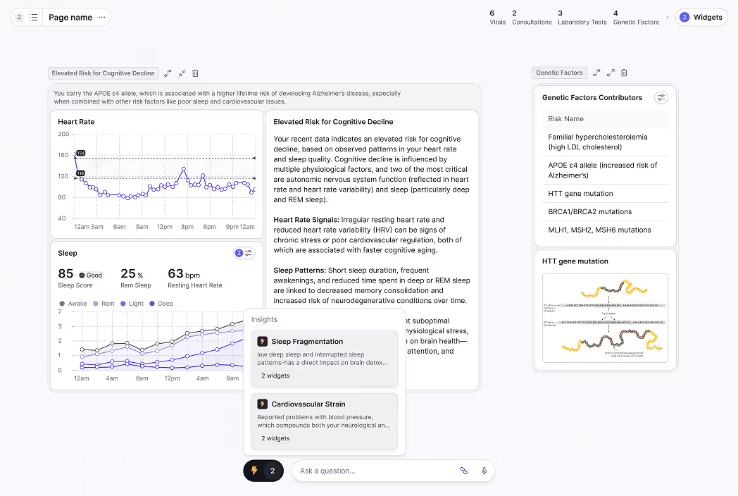
If stakeholder clarity is the priority, evaluate tools like you are choosing dashboard software first. If minutes matter, evaluate monitoring requirements like a Real-Time Interface.
What is big data analytics?
Answer: Big data analytics is the process of collecting, transforming, and analyzing high-volume or high-velocity datasets to uncover patterns, trends, and relationships that drive decisions.
Why it matters: Without a clear process and outputs, big data becomes expensive storage instead of useful insight.
Use when: You need a shared definition before comparing vendors or architectures.
In practice, "big" shows up in one or more dimensions:
· Volume: data too large for spreadsheets or single-machine workflows
· Velocity: data arrives continuously and decisions need frequent updates
· Variety: multiple formats and sources (tables, events, logs, text)
· Complexity: many systems, joins, and business rules
Most teams over-invest in collection and under-invest in consumption. Improving outputs like dashboards and charts often increases adoption faster than adding another processing tool.
What job must my analytics tools do?
Answer: Most organizations need four jobs covered: monitoring, exploration, reporting, and self-serve Q&A.
Why it matters: Tool selection fails when you buy one category to do every job.
Use when: You are building requirements or mapping tools to teams.
Monitoring (real-time or near real-time)
You need live visibility into operational signals: payments, checkout health, uptime, fraud, queue load, stockouts, or SLA risk. If minutes matter, your tool choice is constrained by latency, refresh behavior, and alert workflows.
Reference output expectations: Real-Time Interface.
Exploration (interactive analysis)
Analysts and teams explore changes, segment behavior, and answer why questions. This is where drilldowns, filters, cohorts, and dimensional breakdowns matter.
If you are designing analyst-heavy workflows, align tool selection with what BI teams need: governance, definitions, reusable views, and safe sharing. Reference: Analysts and BI Teams.
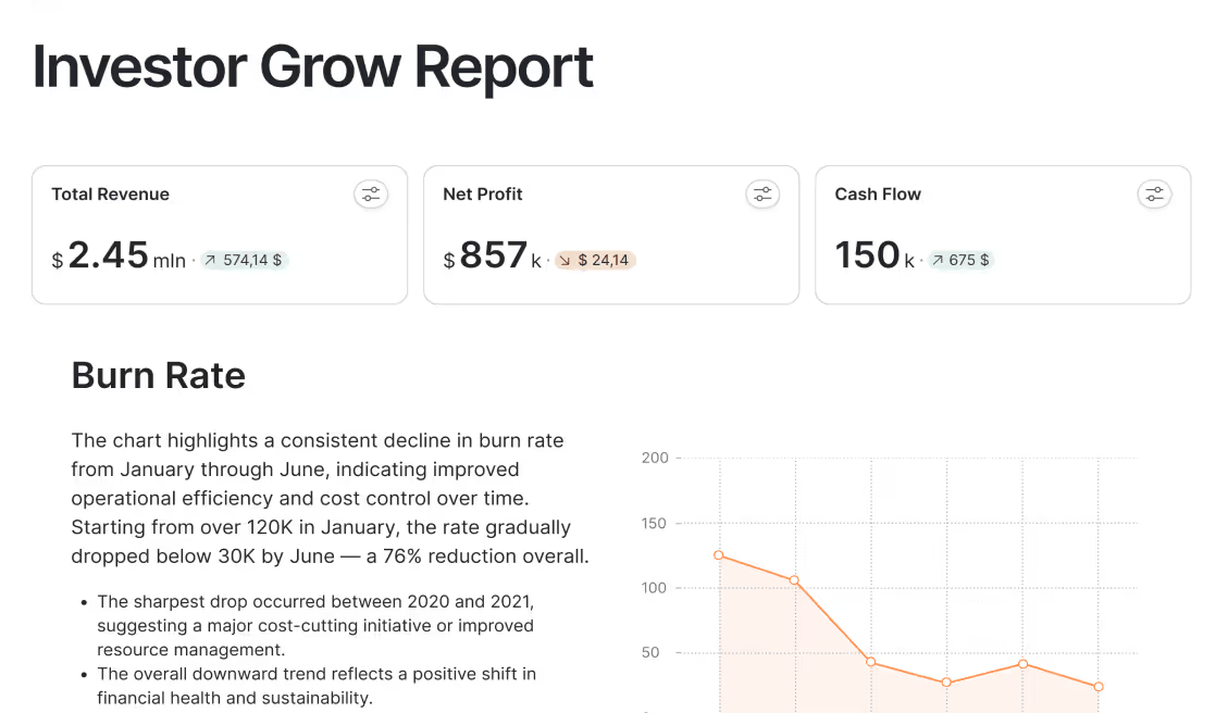
Reporting (executive and stakeholder communication)
Reporting turns analysis into a narrative: what changed, why it matters, and what should happen next. Many tools show numbers but do not help teams communicate decisions.
If leadership alignment matters, evaluate narrative support and story structure. Reference: Storytelling.
Self-serve Q&A (business users asking questions)
If stakeholders want to ask questions without writing queries, you need a governed chat-with-your-data experience that respects definitions and permissions.
Reference: Chat.
What are the layers of a big data analytics stack?
Answer: Most stacks include sources, storage, transformation, computation, and an output layer.
Why it matters: Mapping layers prevents tool sprawl and overlapping purchases.
Use when: Your org already has several tools and you need clarity.
A practical five-layer model:
1. Data sources: applications, product events, payments, ads, CRM, support, finance, logs
2. Storage: a warehouse, lake, or lakehouse for raw and modeled data
3. Transformation and modeling: cleaning, joining, metric definitions, semantic layers, governance rules
4. Analysis and computation: SQL engines, notebooks, distributed compute, ML training, batch jobs
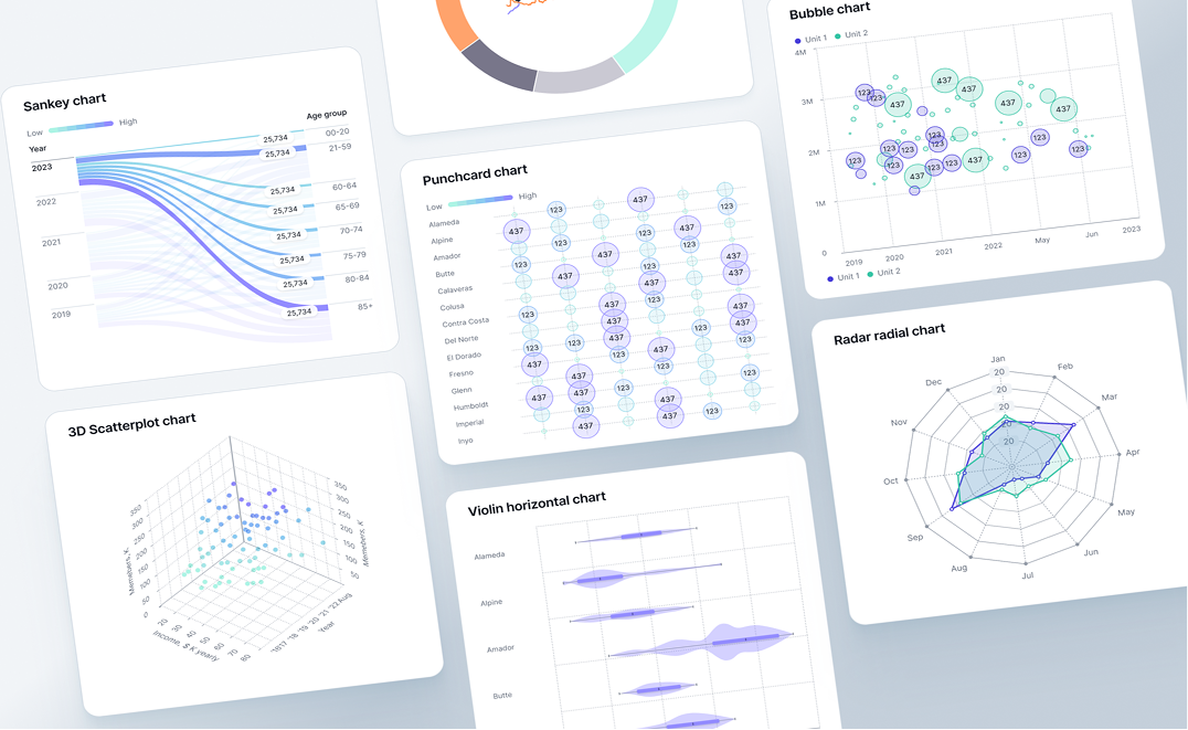
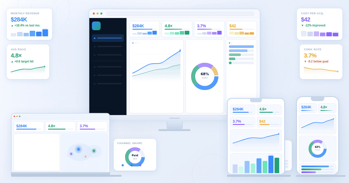
5. Output and decision layer: dashboards, charts, maps, narratives, alerts, and Q&A interfaces
If storage and modeling are already covered, ROI often comes from the output layer. Platform overview: Product.
Which category of analytics tools do I actually need?
Answer: Pick a primary output layer for decisions, then add specialized tools for SQL, notebooks, streaming, and governance as needed.
Why it matters: A coherent stack creates trust. Random tools create conflicting numbers and low adoption.
Use when: You are selecting tools for a team or an organization.
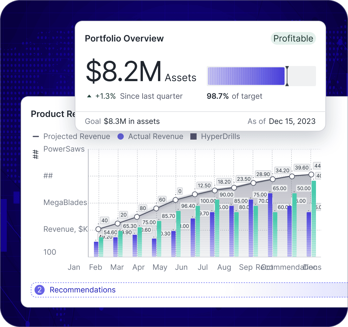
BI and dashboard tools
Best for: recurring KPI tracking, stakeholder visibility, interactive drilldowns, operational reviews.
SQL and query tools
Best for: structured analysis in a warehouse, ad hoc exploration, building models, quality checks.
Notebooks and data science environments
Best for: forecasting, experimentation, ML pipelines, custom modeling.
Streaming and event processing
Best for: event-driven analytics, operational monitoring, near real-time funnel health.
Governance and data management
Best for: definition consistency, lineage, security, access control, audit trails. Without governance, dashboards contradict each other and trust collapses.
How do I compare tools without drowning in feature lists?
Answer: Use a workflow scorecard and test tools against real questions, real data, and peak usage.
Why it matters: Feature checklists hide the failure points that kill adoption: speed under load, permissions, and definition drift.
Use when: You have 2 to 4 finalists and need a repeatable evaluation process.
Scorecard questions that decide most outcomes:
6. Who is the primary user: analysts only, or the whole business?
7. How fast must decisions happen: minutes, hours, daily, monthly?
8. Do you need real-time monitoring, and what latency is acceptable?
9. How many data sources will you connect, and how often do they change?
10. Do you need governed KPIs with definitions and ownership?
11. Can non-technical users explore safely without breaking logic?
12. How does the platform handle scale: concurrency, refresh, performance?
13. How do you share outputs: internal, partners, clients, public links?
14. How do you prove trust: lineage, QA, audit logs, definitions?
15. How do insights become actions: cadence, owners, narratives, alerts?
Simple weighting helps avoid arguments later: performance, integration, governance, usability, and decision-ready outputs should typically carry the most weight.
How should I run a pilot that proves fit?
Answer: A pilot should prove time-to-answer and decision readiness using real data, real users, and peak load behavior.
Why it matters: Pilots catch the failures demos hide: refresh instability, permission issues, governance drift, and adoption friction.
Use when: You are about to commit budget or sign a long contract.
Pilot checklist:
· Use real data volume or a realistic sample, including edge cases
· Pick 2 to 3 real business questions and define success criteria
· Include analysts and stakeholders in the workflow, not just admins
· Test refresh and concurrency at peak usage
· Test governance: KPI definitions, permissions, audit trail
· Test sharing: internal stakeholders and optional external viewers
· Measure time-to-answer: question to decision-ready output
If your pilot produces good charts but weak decisions, improve narrative structure. Reference: Storytelling.
How do I evaluate AI analytics features safely?
Answer: AI is valuable when it sits on top of governed metrics, respects permissions, and produces verifiable outputs.
Why it matters: Ungoverned AI creates confident wrong answers and destroys trust.
Use when: You are buying an AI analytics assistant or data chat capability.
Evaluate AI with these checks:
· Does AI use governed metric definitions or raw data?
· Can outputs be verified and traced back to sources?
· Does it respect access controls and role permissions?
· Does it produce consistent results across users and time?
· Can business users ask questions safely in plain language?
Reference: Chat.
When should I use real-time analytics instead of daily reporting?
Answer: Use real-time when minutes matter and teams can act. Use daily reporting when data needs reconciliation or decisions are strategic.
Why it matters: Real-time dashboards can create noise and overreaction if used for the wrong metrics.
Use when: You are deciding refresh rates, monitoring scope, and alerting strategy.
· Use real-time when delays of minutes cause loss, outages, or customer harm
· Use hourly when you need trend awareness but not instant reaction
· Use daily when data needs reconciliation or decisions are strategic
Reference: Real-Time Interface.
What governance and security requirements are non-negotiable?
Answer: Governance protects trust. Without consistent definitions, dashboards become arguments instead of tools.
Why it matters: Trust is the bottleneck for analytics adoption at scale.
Use when: Multiple teams and stakeholders consume shared KPIs.
Minimum requirements:
· Role-based access control and environment separation
· Metric definitions with owners and change history
· Audit logs and lineage for critical KPIs
· Data masking for sensitive fields and controlled sharing
· A clear review cadence for each dashboard and KPI set
Role-oriented views can reduce confusion and tool misuse: Business Leaders and Analysts and BI Teams.
When do maps and geospatial analytics matter?
Answer: Maps matter when performance and action depend on location: territories, deliveries, store networks, and regional demand.
Why it matters: Location splits often reveal issues that charts hide.
Use when: You operate across regions, warehouses, stores, or delivery zones.
Reference: Maps.
How do I choose tools based on my team structure?
Answer: Your org chart matters. A tool that works for a central BI team can fail in a self-serve organization, and vice versa.
Why it matters: Team structure determines governance needs and adoption speed.
Use when: You are standardizing tools across departments.
Central BI team model
A central team builds and maintains dashboards, definitions, and reporting cadence. Prioritize governance, metric consistency, and strong stakeholder sharing. The upside is trust. The risk is bottlenecks.
Self-serve model
Teams build their own dashboards with lightweight guardrails. Prioritize usability, fast exploration, and templates. The upside is speed. The risk is inconsistent definitions.
Hybrid model
A central team owns core definitions and executive reporting, while teams self-serve for local questions. Prioritize reusable metrics and role-based access. This model scales best for most organizations.
Which tools fit common business use cases?
Answer: Choose tool priorities by decision type: growth optimization, financial reporting, and operational response require different refresh rates and outputs.
Why it matters: One-size-fits-all stacks create noise: marketing needs fast experimentation, finance needs reconciliation, and operations needs real-time visibility.
Use when: You want internal alignment on what each team should use and why.
Use these examples as templates:
· Marketing performance: prioritize segmentation and channel breakdowns, then publish decision-ready dashboards for weekly reviews. Reference: Marketing Teams.
· Finance reporting: prioritize cadence, definition consistency, and auditability. Reference: Finance Teams.
· Operations and logistics: prioritize exception monitoring, bottlenecks, and ownership routing. Reference: Operations and Logistics.
Industry examples can also help you avoid generic KPIs:
· SaaS teams: recurring revenue, retention, and expansion workflows map well to a SaaS KPI dashboard approach. Reference: SaaS Dashboard.
· Ecommerce teams: revenue drivers and funnel diagnostics map well to an ecommerce KPI tree approach. Reference: Ecommerce Dashboard.
Requirement templates you can copy into your pilot
Answer: Write requirements as testable statements so vendors cannot hide behind marketing language.
Why it matters: Pass or fail tests reduce expensive rework later.
Use when: You want consistent evaluation across multiple vendors.
Monitoring requirements (real-time)
· Latency target is defined and measurable
· Refresh behavior is transparent and failures are visible
· Alert rules are supported and can be routed to owners
· Views are readable at a glance, including TV-style monitoring if needed
· Backfill behavior is documented so data gaps do not create false confidence
Dashboard requirements (stakeholder decisions)
· Key KPIs load quickly with realistic concurrency
· Filters and drilldowns work without breaking KPI logic
· Role-based access exists for viewers, editors, and admins
· KPI definitions can be standardized and reused across dashboards
· Sharing works for internal and optional external viewers
Reporting requirements (explain what changed)
· Reports support a clear narrative: what changed, why, what to do next
· Charts can be embedded with context and ownership
· Exports are consistent for leadership updates (PDF or shareable links)
· The workflow supports decision notes or annotations
Data Q&A requirements (ask questions safely)
· Questions map to governed metrics, not ambiguous raw fields
· Answers are checkable (logic, filters, time range are visible)
· Permissions are enforced
· Follow-ups are supported (drilldown, segmentation, time range changes)
Key takeaways
· Start selection from decision outputs: dashboards, charts, monitoring, reporting, and data Q&A.
· Map your stack into layers to avoid overlapping tools and conflicting KPIs.
· Use a scorecard tied to real workflows, not feature lists.
· Run a pilot with real data, real users, and peak concurrency.
· Treat governance as a requirement, not an add-on.
· Use real-time only when action speed matches data speed.
· Use AI on top of governed metrics, with verifiable outputs.
Next step
If your current stack already stores data reliably, the biggest impact often comes from upgrading how teams consume insights: dashboards, charts, real-time monitoring views, and narratives that drive decisions. Explore the platform: Product. If you want to discuss your use case: Contact.