Would you show a dashboard to a shareholder to inform them of the business's end results? Would a marketing professional need to view a presentation of key marketing insights? Would a business manager keep tabs on the dashboard?
Research shows that 40% of business professionals struggle to make sense of their data in spreadsheets alone. But the confusion doesn't stop there: teams need to present the data in the right format to the right people to make the right business decisions. That's why these questions highlight the long-standing confusion: dashboard vs report vs presentation needs clear answers.
The purpose of each format
Which format to choose becomes clear when you understand the purpose of each format. Dashboards help keep tabs on KPIs, reports explain how those KPIs impact the business, and the explanation is given in the form of storytelling narrative to top-level executives.
Dashboard is for monitoring
You monitor the different aspects of the business through a dashboard. It is used to keep tabs on the business's operational performance, from systems to sales, and to gather data for analysis and strategic decision-making. In many ways, dashboards can feel like adding another staff member that never takes time off or goes on vacation.
In simple terms, it answers: What is happening currently?
Types of Dashboard
Dashboards serve different needs based on the business structure and the elements of the business to focus on.
| Dashboard Type |
Definition |
Audience |
Core KPIs |
| Operational Dashboard |
Focus on day-to-day activities to monitor immediate performance |
Sales, IT, Customer Care, Logistics Team |
Daily sales volume, system uptime, order fulfilment rate, ticket resolution time, etc. |
| Strategic Dashboard |
Focus on delivering a high-level review of progress toward the business’s core goal |
VPs, CMOs, CEOs, CTOs, and Directors |
Revenue Growth Rate, Net Promoter Score, Customer Churn, Market Share, etc. |
| Analytical Dashboards |
Focus on offering deep dives into data to explore trends, identity patterns, and investigate the data from different angles; also known as reporting dashboards, they're a core element of business intelligence |
Power users, BI teams, Data analysts, mid-tier professionals |
Customer lifetime value, Correlation Coefficients, Data Quality metrics, Conversion Rates by Segment |
| Tactical Dashboards |
Exist between Operational and Strategic Dashboards to help mid-tier professionals track short and long-term business goals |
Project Managers, Team Leads, Department Heads |
Inventory Turnover, Monthly Sales, Campaign ROIs, Employee Productivity |
| Customer Dashboards |
Focus on metrics that monitor customer satisfaction |
Marketing, Sales, Customer Success Teams, Product Managers |
Customer Satisfaction (CSAT), Net Promoter Score, Active Users, Churn Rate |
| Financial Dashboards |
Keep tabs on the financial health of an organization. |
CFOs, Finance Teams, executive |
Revenue, Gross Margin, Cash flow, Budget Variance etc. |
| Supply Chain Dashboards |
Also known as logistics dashboards, they monitor the flow of goods and materials across multiple regions and levels. |
Supply Chain Managers, Logistics Teams, Procurement Professionals |
Inventory Turnover, Delivery Times, etc. |
Reports are for explanation
You explain the meaning of the data collected and monitored via the dashboard through the report. It is a static sheet with tables, charts, and complex content explaining how the KPIs impact the business.
It simply answers: what has happened and why?
Teams use reports to summarize information to stakeholders. Having a standard format (most of the time), reports are often generated and delivered automatically.
Types of Reports
Business reports serve different needs depending on timing, audience, and complexity of decisions. The table below categorizes them based on modern analytical requirements.
| Report Type |
Definition |
Audience |
Examples |
| Operational Reports |
Their purpose is to deliver insight into short-term performance and execution. |
Managers and Team Leads |
Daily sales report, website performance reports, |
| Analytical Reports |
They interpret the metrics to provide trend analysis, root cause analysis, and highlight comparisons over time |
Analysts, decision makers |
Conversion drop analysis report, Marketing channel performance deep dive |
| Strategic Reports |
They are high level insight reports derived from executive dashboard and are used for long-term planning |
Professionals at leadership positions, and executives |
Quarterly business review (QBR), Market positioning report, Competitive benchmarking report |
| Financial Reports |
They show the financial health of a business |
Finance team, Leadership, Investors |
Profit & Loss statement, Balance sheet, Cash flow report, Budget vs actual report |
| Compliance / Regulatory Reports |
They ensure that all business attributes meet legal or industry requirements |
Regulators, auditors |
Tax filings, ESG disclosures, Industry compliance documentation |
| Exception Reports |
They highlight anomalies within a business organization; help finding bottlenecks |
Delivered to all professionals in all business layers depending on the type of exceptions |
Orders below margin threshold, Downtime exceeding SLA, Fraud detection alerts |
| Ad hoc reports |
They answer specific one-off questions |
Delivered to all professionals in all business layers depending on the type of questions asked |
Why did churn spike last week?
Which region underperformed yesterday? |
Presentation is for alignment and decisions
While reports offer insights, their complexities need to be simplified in order to create a coherent narrative. That's why you translate those insights into stories in the form of presentations.
The presentation basically answers: what does the data mean for my business, and what should be done next?
Reports and dashboards are holistic, showcasing multiple data points and their meanings. Data presentations, on the other hand, are precise narrative arcs designed according to the audience.
Types of Presentation
Presentations vary based on the audience. However, the common denominator is that they are always meant for leaders.
| Type |
What It Provides |
Audience |
Examples |
| Executive Presentation |
High-level insights tied to strategic goals, risks, and opportunities. Focuses on decisions, impact, and business direction rather than raw data. |
C-suite, senior leadership, board members |
Quarterly Business Review (QBR) presentation, Board meeting deck, Annual strategy presentation |
| Operational Presentation |
Performance updates are connected to short-term execution and tactical improvements. Highlights wins, bottlenecks, and immediate actions. |
Managers, team leads, department heads |
Weekly performance review, Sprint review deck, Monthly operations update |
| Analytical / Insight Presentation |
Deep dive into trends, root causes, and patterns uncovered in reports. Connects data analysis to implications. |
Analysts, decision- makers, cross-functional teams |
Conversion drop analysis presentation, Marketing channel performance review |
| Investor Presentation |
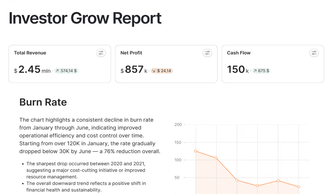
Financial performance, growth narrative, market positioning, and forward outlook. Designed to build confidence and justify valuation. |
Investors, venture capital firms, shareholders |
Investor update deck, Fundraising pitch deck, Earnings call presentation |
| Sales / Client Presentation |
Business impact framed from the customer’s perspective. Focuses on value, ROI, and differentiation. |
Prospects, existing clients, partners |
Sales pitch deck, Proposal presentation, Account review meeting |
| Change Management Presentation |
Explains strategic shifts, restructuring, or transformation initiatives. Aligns teams around new directions and expectations. |
Employees, department leaders, stakeholders |
Organizational restructuring announcement, Digital transformation roadmap |
| Crisis / Risk Presentation |
Communicates risks, issues, and mitigation strategies clearly and calmly. Focuses on response plans and accountability. |
Leadership, board, and affected stakeholders |
Incident response briefing, Revenue shortfall discussion, Compliance risk update |
This three-tier approach of dashboards, reports, and presentations mirrors Gartner's Analytics Maturity Model, which focuses on descriptive, diagnostic, and prescriptive analytics.
When to use a dashboard?
Dashboards shine when your focus is on immediacy and continuous visibility of KPIs:
- Real-time monitoring matters: To get live updates on business performance, system health, or operational metrics that change throughout the day, use a dashboard.
- Multiple stakeholders need access: To not generate individual reports repeatedly when different team members need simultaneous access to the same data, you need a dashboard.
- Quick glance decisions are critical: To give professionals the power to assess status at a glance and make immediate tactical adjustments without deep analysis, you need a dashboard.
- Tracking against targets consistently: To continuously monitor progress toward goals, quotas, or KPIs where ongoing visibility prevents surprises and enables course correction, you need a dashboard.
- Operational efficiency drives value: To maintain smooth operations, catching issues early, and keeping daily workflows running efficiently, you need a dashboard.
When to use a report
Reports matter when understanding the "why" behind the numbers is your main goal.
- Historical analysis is required: To examine past performance, identify trends over time, or understand what happened during specific periods, you need a report.
- Detailed explanations matter more: To provide stakeholders with context, interpretation, and narrative around the numbers, not just raw data visualization, you need a report.
- Formal documentation is necessary: To create official records for compliance, audits, regulatory requirements, or formal stakeholder communication that demands structured permanent documentation, you need a report.
- Scheduled reviews drive accountability: To deliver comprehensive performance summaries on predictable recurring schedules for weekly, monthly, or quarterly reviews, you need a report.
- Deep-dive investigation is needed: To answer specific questions that require drilling into data, comparing multiple variables, or conducting root cause analysis, you need a report.
When to use a presentation
Presentations matter when you need to convince stakeholders to align around a shared vision:
- Executive decisions need to be made: To help leadership choose between strategic options, approve budgets, or commit resources based on data-driven recommendations, you need a presentation.
- Storytelling creates impact: To connect emotional resonance with data and build narratives that persuade stakeholders toward specific actions, you need a presentation.
- Alignment across departments matters: To create a unified understanding of priorities, strategy, or direction that synchronizes everyone toward common objectives and accountability, you need a presentation.
- Securing buy-in is critical: To convince investors, board members, or senior leadership to support initiatives, approve funding, or endorse strategic pivots, you need a presentation.
- Complexity needs simplification: To translate dense reports or overwhelming dashboards into clear, actionable insights tailored specifically for your audience's needs, you need a presentation.
A Simple Decision Framework
The best simple decision framework to choose between dashboard, report, and presentation is to answer the following three questions:
- Who will show it?
- How often should you provide it?
- How much depth should the information have?
This audience-cadence-complexity framework draws from dimensional modeling principles that prioritize end-user needs in BI design.
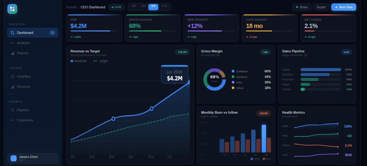
Dashboard
- Audience: Dashboards are intended for operational teams, managers, and professionals who constantly monitor visibility and performance metrics.
- Cadence: Dashboards deliver data continuously, in real-time, and are refreshed multiple times daily to support ongoing monitoring and immediate tactical responses.
- Complexity: Dashboards have low to medium complexity because they focus on key metrics that require little interpretation, prioritizing comprehension and rapid decision-making.
Report
- Audience: Team leads, analysts, departments, and stakeholders who want to get a clear picture of what's happening and why.
- Cadence: Reports are delivered at scheduled intervals, ranging from daily to quarterly, as they help the audience review the system holistically.
- Complexity: Reports have medium to high complexity, as they include everything from trends, texts, and comparisons to analyses that explain matters and offer deeper insights.
Presentation
- Audience: Executives, board members, investors, and cross-functional leadership who make strategic decisions and allocate resources.
- Cadence: Presentations are delivered either on an event basis or milestone basis, as they consist of quarterly reviews, board meetings, and strategy sessions.
- Complexity: Presentations are simplified to distill complex data into clear narratives with recommendations that can be acted on quickly.
The best workflow: dashboard to story
Research shows that organizations effectively using visualization are 28% more likely to make timely strategic decisions. The secret? The most effective data strategy doesn't choose between these formats. It connects them in a continuous flow from monitoring to action.
- Step 1: Use dashboards to monitor: Track real-time performance across key metrics. Dashboards alert you to changes, anomalies, and trends that demand attention.
- Step 2: Use reports to investigate: Use dashboard reporting tools to understand what happened, why it happened, and what patterns emerged when dashboards signal issues or opportunities.
- Step 3: Analyze the data and interpret: Dive into report data to identify root causes, compare scenarios, and extract insights that connect metrics to business impact.
- Step 4: Establish a narrative: Create a cause-and-effect narrative that explains how key metrics impact specific business elements. It answers: What does this mean for our business, and what should we do?
- Step 5: Use presentations to influence decisions: Use the narrative to create a presentation and present it to leadership with clear recommendations on how to maximize returns.
FAQs
Quick answers about demos, onboarding, integrations, and security.
A dashboard is built for monitoring. It shows the most important KPIs in a single view and updates on a continuous cadence (often hourly, near real-time, or daily) so teams can spot changes quickly. A report is built for explanation. It is typically more static, includes more context, and is designed to answer what happened and why it happened using comparisons, commentary, and supporting tables or charts. Use dashboards to detect signals and use reports to investigate those signals and document conclusions.
Yes, and that is usually the best approach. Dashboards help you monitor KPIs and detect shifts early, reports help you investigate the cause behind those shifts with deeper breakdowns, and presentations help you align stakeholders around decisions and next steps. A practical workflow is: monitor weekly or daily via dashboard, produce a report for the key changes and drivers, then convert the report into a narrative presentation for leadership or cross-functional alignment. This prevents “dashboard screenshot chaos” and keeps decisions consistent.
Choose a presentation when the goal is alignment and decision-making, not documentation. Reports are best when you need depth, detail, and a record of what happened and why. Presentations are best when you need to simplify complexity, highlight the few insights that matter most, and persuade an audience to approve a plan, allocate resources, or change direction. If the audience is executives, investors, or cross-functional leadership, a presentation format is usually the right choice because it frames insights as a story with clear recommendations and ownership.
Access should match responsibility. Dashboards are most useful for operational teams, managers, and anyone who needs continuous visibility into performance and must respond quickly. That typically includes marketing operators, sales managers, customer support leads, logistics and fulfillment managers, and team leads running day-to-day execution. Executives also need dashboards, but usually a simpler strategic view rather than the operational detail. The key is role-based access: teams should see the KPIs they can influence, while sensitive metrics (finance, customer data) should be restricted to the right users.
Reports should follow your decision cadence. Daily reports are useful for high-volume operations or fast-moving performance areas, but many teams benefit more from weekly reporting for trend detection and monthly reporting for leadership review. Finance and compliance often require monthly or quarterly cycles because data needs reconciliation and auditability. The best rule is: if you cannot act on a change within the reporting window, reduce the frequency. Reports work best when they summarize the period, explain the drivers, and end with decisions, owners, and next actions.
An executive presentation is designed to drive a decision quickly. It distills complex analysis into a short narrative: what changed, why it matters, what risks exist, and what actions you recommend. It minimizes tables and maximizes clarity, using only the few charts needed to support the point. An analytical report is designed for depth and validation. It includes breakdowns, comparisons, assumptions, and supporting evidence so analysts and stakeholders can verify conclusions. In practice, the report proves the truth, while the presentation communicates the truth and converts it into action.
Choose the format by answering three questions: who will use it, how often they need it, and how much depth they need to act. If the audience needs continuous visibility and fast reactions (operators, managers), use a dashboard with a small set of KPIs and clear filters. If the audience needs explanation, accountability, and a record of what happened (analysts, team leads, finance), use a report with context, comparisons, and conclusions. If the audience needs alignment and approval (executives, board, investors), use a presentation that summarizes the few insights that matter most and ends with recommendations, owners, and next steps.