Between 60 and 80 percent of business intelligence dashboards go unused despite significant investment in tools, data infrastructure, and analyst time. A 2025 survey of 200 product leaders and data teams found that 72 percent of users regularly abandon dashboards for spreadsheets. Most of the dashboards they abandon work exactly as designed. The problem is that working correctly and being used are two different things, and most dashboard projects optimize for the first without thinking about the second.
This article covers the five specific reasons dashboards get abandoned, how to audit a dashboard that is already failing, and what the fix looks like for each failure mode.
Why Dashboards Fail: The Five Failure Modes
1. Built for the Requester, Not the User
The person who commissions a dashboard is almost never the person who needs to use it daily. An executive requests a revenue overview. The analyst builds what the executive described. The sales team gets a dashboard designed for someone two levels above them, showing metrics they can't act on and missing the ones they check every morning.
This is the most consistent finding across every study of dashboard adoption. Requirements gathered from the top of an organization produce dashboards that show what leadership wants to see, not what the operations manager or finance analyst needs to answer questions in their actual job. The gap between who commissions and who uses is where most dashboard projects start to fail, before a single chart is built.
The fix is straightforward and almost never done: map the decisions each audience makes before selecting any metrics. Every metric on the dashboard should trace back to a specific decision a specific person makes on a regular cadence. If you can't identify the decision, the metric doesn't belong on the screen.
2. The Trust Collapse
This failure mode is the most expensive and the hardest to recover from. It works like this: a number on the dashboard doesn't match a number from another system. Maybe it's a timing difference. Maybe it's a calculation difference. Maybe someone filtered incorrectly. The explanation exists. Nobody remembers it.
Word spreads that the dashboard shows the wrong numbers. The story hardens into one belief about the BI system: it has data quality problems. People stop using it. The underlying issue gets fixed. Nobody comes back. Six months later the dashboard is technically correct and completely unused because the habit of not using it is already established.
The prevention is not better data. It's documentation before launch. Every metric defined in writing (what it includes, what it excludes, how it differs from numbers in other systems) and presented at launch as context, not as a defense. Teams that skip this step are not saving time. They are setting up the trust collapse that makes the whole project fail.
3. No Decision Anchored to the Dashboard
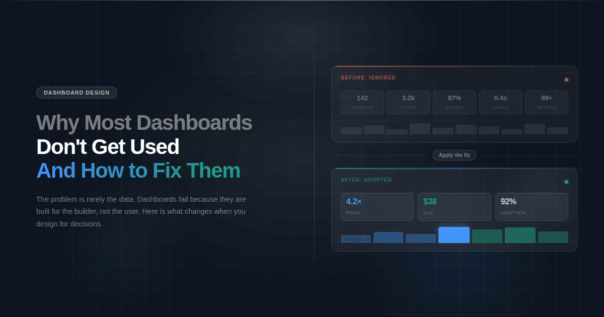
A dashboard showing two million impressions and a 3.2 percent click-through rate tells a CEO nothing about whether the marketing investment is working. A dashboard showing that paid campaigns acquired 340 new customers at a $90 CAC against an average 18-month LTV of $480 tells a CEO a great deal. Both are marketing dashboards. Only one connects data to a decision.
Most dashboards show what the data team had access to, not what the business team needs to answer. The distinction matters because dashboards people use daily answer a question someone has to answer regularly. Dashboards people stop using show data that might be interesting but doesn't require any action when it changes.
Before adding any metric to a dashboard, ask: if this number moved 20 percent in either direction, would anyone do anything differently? If the answer is no, it's not a dashboard metric. It belongs in a report that someone reads monthly, not on a screen that someone is supposed to check every morning.
4. Launch Is Treated as the Finish Line
The dashboard is presented in a single meeting. People nod. The meeting ends. Nobody has actually learned how to use it or understood why it should change how they work. Adoption doesn't happen at launch. It happens in the weeks after, when the dashboard either replaces an existing habit or gets ignored in favor of it.
Most BI projects treat go-live as the completion of the project. Go-live is actually the start of the adoption phase. A dashboard that isn't referenced in meetings, included in recurring reports, or pushed to users on a schedule competes with every other tool and habit the team already has. In that competition, the incumbent usually wins.
The teams that achieve high adoption treat the post-launch period as a product phase, not a project wrap-up. They track who is opening the dashboard and who isn't. They follow up with non-users. They adjust metrics that nobody is looking at. They treat the dashboard as something that earns its place in the workflow, not something that earns its place by existing.
5. The Existing Habit Wins
Every team already has a way of getting the data they need today. It might be a manual Excel report assembled every Monday morning, a CRM query someone runs before the weekly meeting, or a Slack message to the analyst. It works. Not efficiently, but it works. The team trusts it because it has always given them the same answer.
A new dashboard only wins if it is meaningfully easier or more useful than whatever it is replacing. If it isn't, login friction, an unfamiliar layout, or slightly different numbers are enough to send people back to whichever habit they already have.
This is why the most successful dashboard implementations replace a specific manual process rather than adding a new one. The dashboard doesn't compete with existing habits when it eliminates one. A finance dashboard that replaces the Sunday-night spreadsheet assembly wins immediately because it removes a task people were already doing. A dashboard that sits alongside existing processes requires active behavior change, and behavior change is hard.
When the dashboard launches, retire the manual report it replaces. Not both available during a transition period. Retire it. If the old report is still accessible, people use it because it's familiar and they trust it. Remove the alternative and adoption follows.
How to Audit a Dashboard Nobody Is Using
If you have a dashboard that was built, launched, and is now sitting unused, the problem is diagnosable. Work through these five questions in order.
Who was it built for? Pull up the dashboard and ask whether the metrics on screen match the decisions the daily user actually makes. If the dashboard shows what a VP wants to see while the daily user is a team lead, that's failure mode one. The fix is a conversation with the actual user about what they need to know each morning, not a redesign of the existing dashboard.
Has anyone said the numbers are wrong? Even once, even in passing, even as a joke in a meeting. If yes, that belief is probably still active regardless of whether the underlying issue was fixed. The fix is a documented metric glossary published to all users, explaining every number, its source, and how it differs from numbers in other systems. Publish it proactively, not in response to the next complaint.
Can every metric on the screen be connected to a decision? Go through each chart and KPI card and write down the decision it informs. If you can't write it down in one sentence, it doesn't belong on the dashboard. Remove it. A dashboard that gets smaller and more focused gets used more, not less.
What process does it replace? If the answer is nothing, and the dashboard was built to add visibility rather than to replace a manual process, that is why nobody is using it. Find the equivalent manual process and make the dashboard a direct replacement. Route the Monday morning Excel report to the marketing dashboard instead. Make the switch mandatory for one team for two weeks. Adoption follows the path of least resistance.
When was the last time anyone looked at who is using it? Dashboard analytics exist in most BI platforms, and platforms like Fusedash log which views are opened and how often. Pull the usage data. Identify the non-users. Have one conversation with each of them about what they use instead. The answer will tell you exactly which failure mode you are dealing with.
The One-Decision Rule
The single most useful framework for building a dashboard that gets used is this: every metric on the screen must trace back to one decision, made by one person, at one cadence.
Not a category of decisions. Not a department's general awareness. A specific decision. "Do we shift budget from paid social to paid search this week?" is a decision. "How is marketing performing?" is not. A dashboard built around the first question has five or six metrics on it and gets checked every Monday. A dashboard built around the second has twenty-five metrics on it and gets checked never.
The same rule applies in every function. "Does this week's close need to be escalated?" is a decision a controller makes at a specific point in the month. "How is the finance team doing?" is not. The first dashboard has budget vs actual, AR aging, and close task status. The second has forty KPIs and gets opened twice a year.
This rule also applies to dashboard scope. A single dashboard cannot serve a CMO, a paid media manager, and an agency client simultaneously. Each of those people makes different decisions at different cadences with different levels of detail. Building one dashboard for all three produces something too shallow for the analyst and too complex for the executive. The result is three people who each use a different workaround.
What a Dashboard That Gets Used Actually Looks Like
It has fewer metrics than the team originally requested. There is a named owner responsible for its accuracy and relevance. It replaces a process the team was already doing manually. The person who uses it daily had input into what goes on it, not just the person who commissioned it. When a number looks different from the CRM, there is a written explanation that doesn't require an analyst to explain it in a meeting.
Users don't have to remember to open it. It gets pushed to them on a schedule. Every quarter someone checks whether the metrics still reflect the decisions the team is actually making. When a metric hasn't triggered any action in three months, it gets removed.
None of these are design principles. They are operational decisions that determine whether a dashboard becomes part of how a team works or becomes another tab nobody opens.