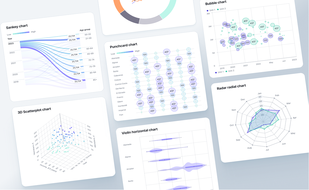
Interactive data visualization tools let you explore data by clicking, filtering, and drilling into charts in real time, without rebuilding a report every time the question changes. When you click a data point, connected charts refilter, drill-down paths open, and the view narrows to exactly what that selection means. Static charts show a fixed output. Interactive ones answer follow-up questions.
Not all tools marketed as interactive provide the same depth. One platform lets you change a date range; another generates a complete cross-filtering dashboard from a plain-language description. This article uses a three-level framework to compare them.
The best interactive data visualization tools in 2026:
- Fusedash: Best for AI-generated interactive dashboards without manual configuration
- Tableau: Best for complex, custom interactive visualization with maximum design control
- Power BI: Best for Microsoft-connected teams needing interactive BI at accessible pricing
- ThoughtSpot: Best for search-based, conversational interactive data exploration
- Looker Studio: Best free option for Google-connected interactive reporting
- Qlik Sense: Best for associative, relationship-driven interactive data exploration
- Metabase: Best open-source interactive option for technical teams
- Zoho Analytics: Best mid-market option combining BI, AI, and interactive dashboards
Keep reading for the framework and full tool breakdown.
What "Interactive" Actually Means in Data Visualization
Interactive data visualization isn't just the ability to change a date range. It's the ability to ask a question with a click and get a new answer without leaving the dashboard.
Most tools use "interactive" as a general marketing term. Filtering a dropdown and generating a drill-down path from a natural language query are both "interactive" in that framing. They're not the same thing. Here are the six capabilities that distinguish genuine interactivity from tools that apply the label loosely:
Cross-chart filtering: clicking one data point updates all connected charts on the dashboard simultaneously, so every visual reflects the same selection context.
Drill-down navigation: moving from a summary metric to underlying detail without leaving the dashboard, for example from total Q3 revenue to revenue by region.
Real-time data updates: the dashboard reflects live data changes automatically, no manual refresh required.
Natural language exploration: asking a follow-up question and receiving a chart-backed answer within the same interface, without writing a query or building a new report.
Anomaly surfacing: the platform identifies unusual patterns in your data and surfaces them without requiring manually configured thresholds.
Shareable interactivity: the person receiving a shared link can interact with the same filters and drill-down paths, not just view a static image.
Most tools in this comparison cover two or three of these six capabilities. The framework below shows where each one falls.
The Three Levels of Interactive Data Visualization
Not every tool marketed as interactive provides the same depth. These three levels describe what actually happens when a user engages with a chart, and which tools belong at each level.
Level 1: Display Interactivity
Level 1 tools let users view charts that respond to basic inputs: date range selectors, category dropdowns, and metric toggles.
Clicking a bar chart doesn't change other charts on the dashboard. There's no AI, no natural language querying, and no cross-filtering. Looker Studio, Infogram, and Datawrapper sit at this level. They're fast, often free, and require no technical setup.
Level 2: Exploratory Interactivity
Level 2 tools support deeper exploration: cross-filtering, drill-down paths, natural language queries, and AI-assisted anomaly detection.
The dashboard is still configured by a human. A data analyst builds the structure; the AI accelerates exploration of a view they set up. Power BI, Tableau, ThoughtSpot, and Qlik Sense all operate at this level. Teams running business intelligence dashboards at this level get real analytical depth, but someone still has to build and maintain the underlying configuration.
Level 3: Generative Interactivity
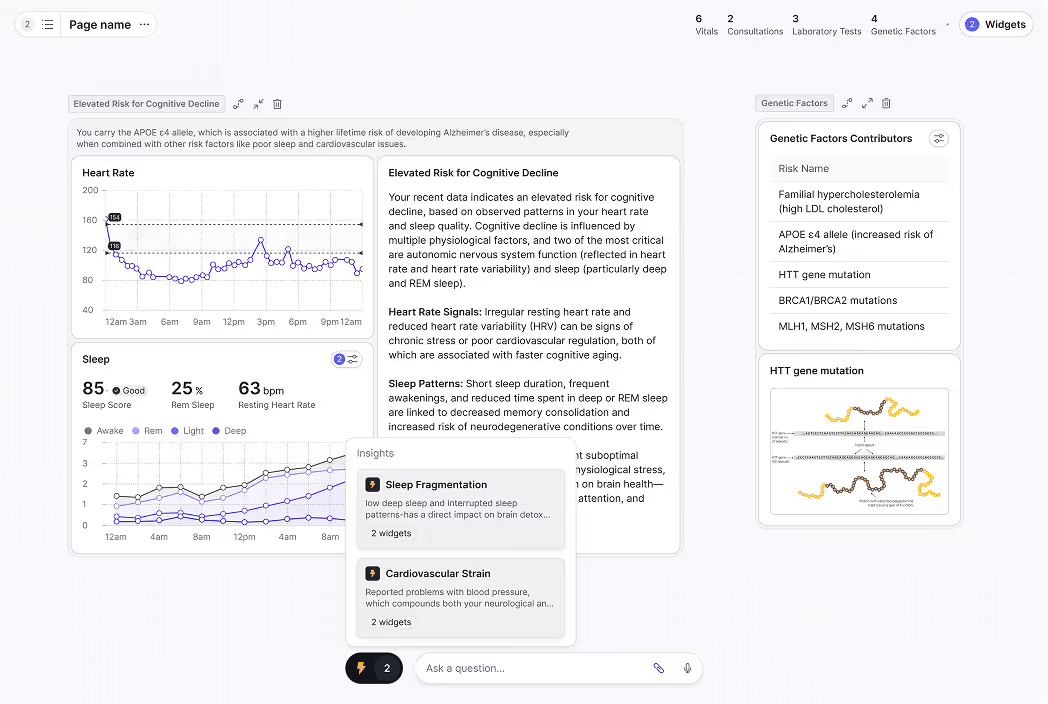
Level 3 is what's known as generative analytics: the platform generates the complete interactive view from a description you type, rather than requiring you to configure it. Layout, chart types, filters, drill-down paths, KPI logic, and anomaly detection are all produced automatically.
Fusedash is the only tool in this comparison at Level 3. The interactive KPI dashboards it produces are fully interactive on delivery. This level suits business teams, agencies, and SaaS companies that need accurate, interactive views without a BI analyst.
Quick Comparison: 8 Tools at a Glance
The table below compares interactivity level, AI capability, technical barrier to build and maintain, real-time support, no-code availability, and starting price. The full breakdown follows.
The tool-by-tool breakdown below covers each platform's interactivity in practice.
Tool-by-Tool Breakdown
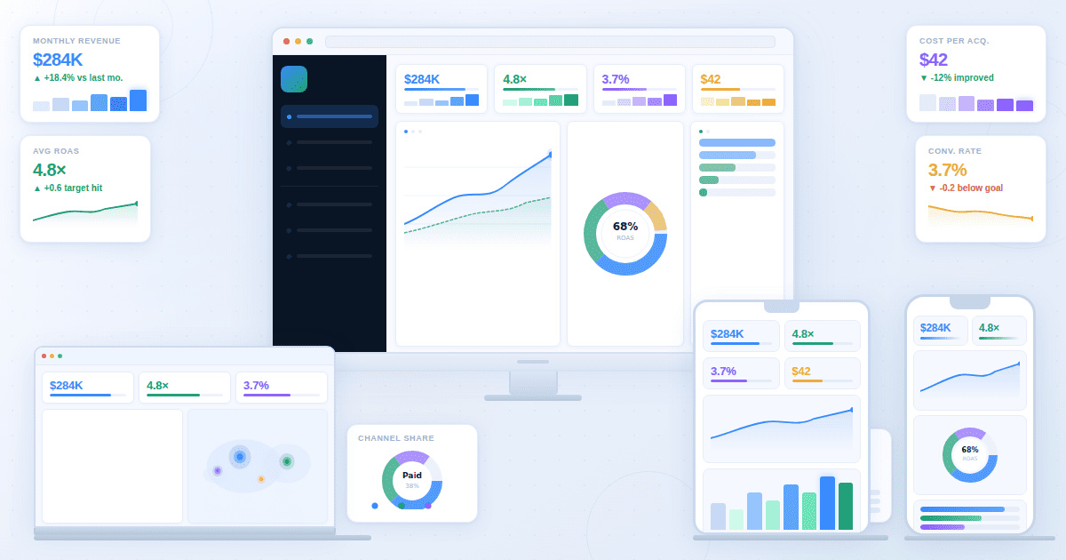
Fusedash: Level 3 Generative Interactive Visualization
What it does: Fusedash is a generative analytics platform that produces complete interactive dashboards from a plain-language description. Filters, drill-downs, KPI logic, and anomaly detection are built in automatically. It runs on Model Context Protocol (MCP), so teams connect the AI model they prefer (Claude, GPT, or any compatible model) rather than being locked into one provider's capabilities or pricing.
Interactive features:
- Cross-chart filtering: clicking any data point refilters all connected charts to reflect that selection, with no manual filter setup required
- AI data chat: ask follow-up questions about any metric on screen and receive chart-backed answers through data chat without leaving the dashboard
- Real-time monitoring: the real-time dashboard updates as data changes and surfaces anomalies without manually configured thresholds
- Shareable interactivity: recipients access the full interactive dashboard via a single link, no viewer login required
Best for: business teams, marketing agencies, and SaaS companies that need fast interactive dashboards without a BI analyst to build and maintain them.
Honest limitation: fewer pre-built data connectors than Tableau or Power BI; works best with CSV exports, REST APIs, or MCP-connected sources, not complex multi-source SQL environments.
Pricing: free trial available; AI features use token-based pricing.
Tableau: Level 2 Exploratory Interactive Visualization
What it does: Tableau is an enterprise visualization platform producing highly customizable interactive dashboards with advanced drill-down paths, cross-data filtering, and AI-assisted exploration tools.
Interactive features:
- Cross-source filtering: filter across multiple data sources within a single dashboard, maintaining context as users move between views
- Tableau Agent: an AI assistant that lets users ask questions in natural language and receive visualization suggestions directly in the builder
- Dynamic Zone Visibility: dashboard sections show or hide based on user selections, so one dashboard adapts to different exploration paths without building multiple views
- Drill-down paths: configurable multi-level drill paths from summary to row-level data with full context preservation
Best for: data analysts and visualization specialists who need maximum creative control over complex dashboards.
Honest limitation: the highest cost and steepest learning curve of the platforms compared; complex views require significant time even with AI assistance.
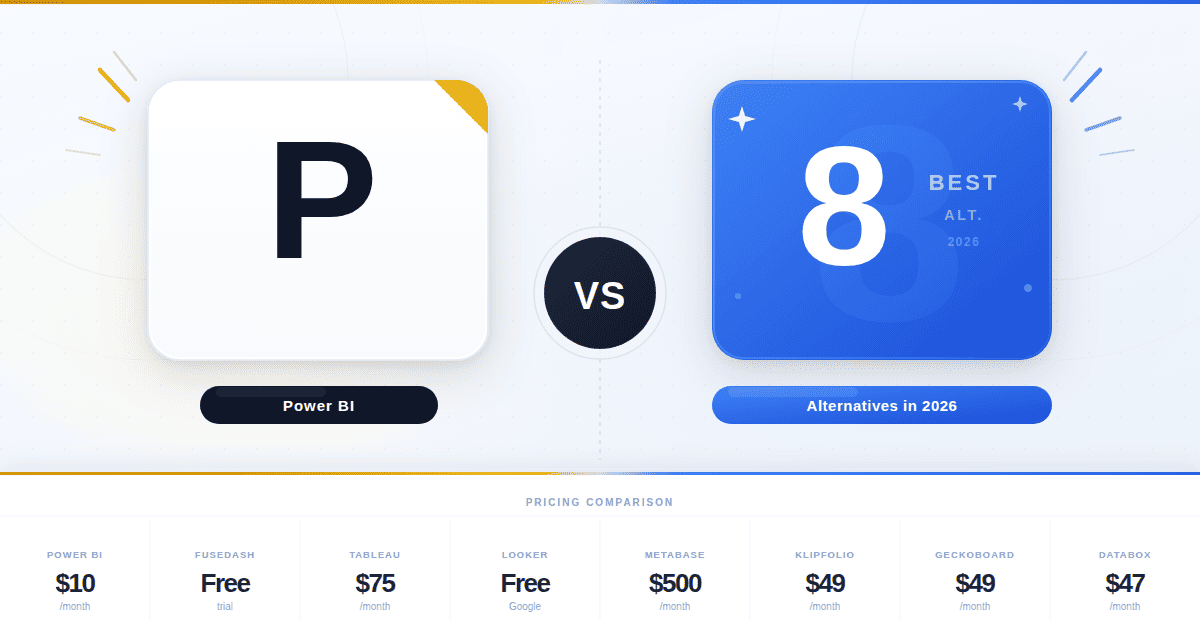
Pricing: from $42/user/month to build dashboards (Explorer); $75/user/month (Creator); $15/user/month for view-only access (Viewer). See Tableau pricing.
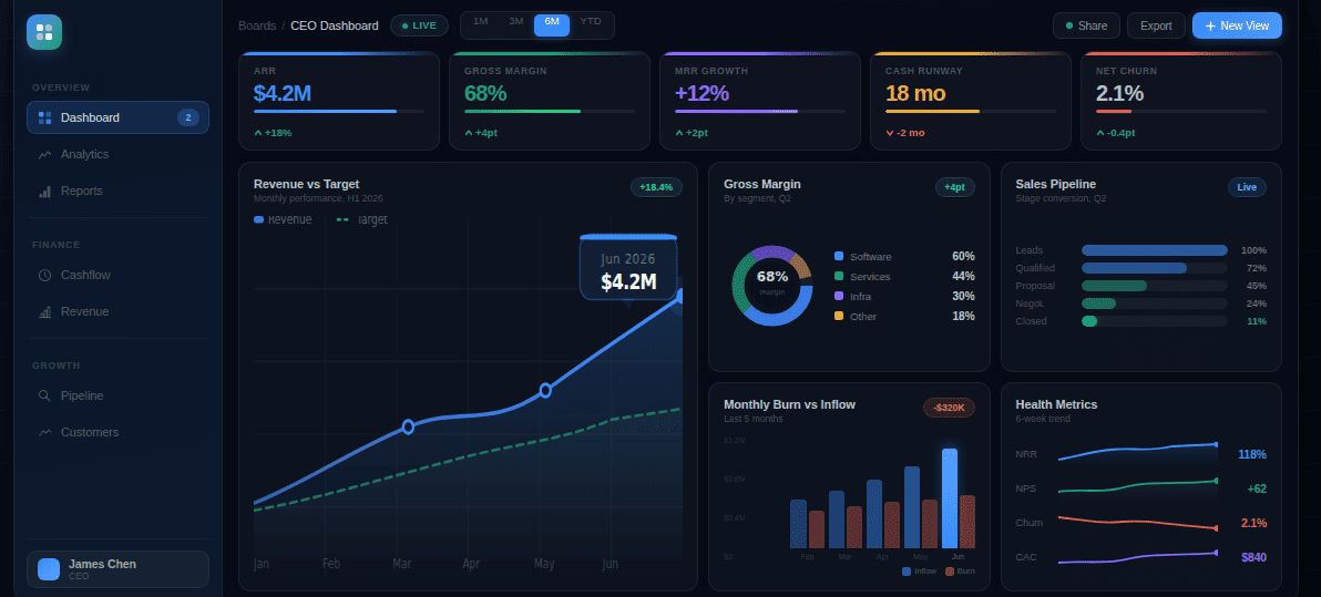
Power BI: Level 2 Exploratory Interactive Visualization
What it does: Microsoft's BI platform produces interactive dashboards with deep Microsoft ecosystem integration, AI-assisted exploration through Copilot, and real-time data streaming support.
Interactive features:
- Cross-report drill-through: click a summary metric in one report and navigate to a detailed report filtered to that selection, across separate report pages
- Copilot natural language: ask questions about your data in the report interface and receive chart responses without writing DAX formulas
- Q&A visual: a dedicated component that accepts natural language questions and renders an immediate chart answer within the dashboard
- Real-time streaming datasets: push datasets that update dashboards live as data arrives, without scheduled refresh
Best for: organizations using Microsoft 365 or Azure, and Excel-familiar teams moving into interactive BI.
Honest limitation: DAX formula complexity is a significant barrier for advanced metrics; full Copilot requires the Premium Per User license at $24/user/month.
Pricing: Power BI Pro at $10/user/month; Premium Per User at $24/user/month. See Power BI pricing.
ThoughtSpot: Level 2 Exploratory Interactive Visualization
What it does: ThoughtSpot is a search-first analytics platform where users explore data by typing questions. Liveboards update in real time, and Spotter surfaces patterns proactively.
Interactive features:
- Search-based exploration: type any business question and ThoughtSpot queries connected sources to return a visualization, with no SQL or predefined reports required
- Liveboards: dashboards that update continuously, with pinboards users can personalize without changing the source dashboard
- Spotter AI analyst: an embedded AI that proactively surfaces trends, anomalies, and correlations, raising observations users didn't ask for
- Drill anywhere: click any data point and drill into underlying data without a configured drill path
Best for: teams that want search-driven exploration and can justify enterprise pricing.
Honest limitation: pricing is enterprise-scale and not publicly listed, making evaluation expensive in time and budget; connecting data sources requires a technical implementation.
Pricing: custom enterprise pricing; contact ThoughtSpot for a quote.
Looker Studio: Level 1 Display Interactive Visualization
What it does: Google's free web-based reporting tool connects to Google Analytics, Ads, Sheets, BigQuery, and hundreds of third-party sources to produce shareable interactive reports with basic filter controls.
Interactive features:
- Date range controls: viewers adjust the time period on any report without editor access or rebuilding the view
- Cross-source filter controls: a filter applied in one chart section updates other charts pulling from different data sources. This is filter-based, not click-based cross-chart filtering.
- Drill-down to row level: some chart types support clicking through from aggregated data to underlying rows
- Collaborative editing: multiple team members can edit the same report simultaneously, similar to Google Docs
Best for: digital marketers and small teams primarily working with Google Analytics or Ads data.
Honest limitation: performance degrades with large datasets; interactivity is limited to display controls with no AI exploration or anomaly detection.
Pricing: free. See Looker Studio. Looker Studio Pro available as part of Google Workspace at $9/user/month.
Qlik Sense: Level 2 Exploratory Interactive Visualization
What it does: Qlik Sense uses an associative analytics engine that shows selected and excluded values across every connected chart when you click a data point, revealing relationships that predefined drill paths miss.
Interactive features:
- Associative exploration: clicking any value highlights related data and grays out excluded data across every connected chart simultaneously
- Smart search: type a keyword and Qlik searches all data fields, returning values and related associations rather than just matching records
- Augmented analytics: AI-generated insight suggestions surface patterns the user didn't query for, displayed alongside user-built charts
- Self-service app creation: business users build their own analytics apps within governed parameters without IT involvement
Best for: organizations that need to explore complex data relationships where connections between metrics matter as much as the metrics.
Honest limitation: the associative model takes time to learn. Grayed-out values are frequently misread as errors by new users, and onboarding takes longer than most comparably priced tools.
Pricing: Qlik Sense SaaS starts at approximately $30/user/month; enterprise pricing varies.
Metabase: Level 1–2 Open-Source Interactive Visualization
What it does: Metabase is an open-source BI tool for querying databases, building interactive dashboards, and sharing results via public links or embedded components, with a free self-hosted version.
Interactive features:
- Question builder: a visual interface that lets non-technical users build queries by selecting fields, applying filters, and setting groupings without SQL
- Dashboard filters: shared filter controls let viewers apply date ranges or category filters across multiple charts simultaneously
- Drill-through to detail: click an aggregated value to see the row-level records that produced it
- Public links and embedding: dashboards share via a public link with no login required, or embed inside other applications
Best for: technical teams that want self-hosted control over their analytics, and startups that need interactive reporting without licensing costs.
Honest limitation: the free version requires a developer to set up and maintain the server; SAML auth, data sandboxing, and usage analytics require the paid cloud version at $500/month.
Pricing: free (open-source, self-hosted); Metabase Cloud at $500/month. See Metabase pricing.
Zoho Analytics: Level 2 Exploratory Interactive Visualization
What it does: Zoho Analytics combines interactive dashboards, AI-powered exploration through its Zia assistant, and integration with the Zoho product suite and external data sources.
Interactive features:
- Zia AI assistant: ask questions in natural language and Zia returns reports, KPI widgets, and trend summaries without SQL or chart configuration
- Dynamic dashboards: clicking charts and KPI widgets cross-filters connected visualizations across the dashboard in real time
- Automated alerts: Zia monitors data continuously and sends notifications when metrics show unusual patterns, no manual threshold setup required
- Collaborative annotations: team members leave comments directly on specific data points, with threads attached to the visual
- Embedded analytics: dashboards embed into external applications or customer portals via iframe, with row-level security controlling what each viewer sees
Best for: mid-market teams that need AI-powered exploration and self-service dashboards at a lower price point than ThoughtSpot or Tableau.
Honest limitation: works best within the Zoho ecosystem; teams using Salesforce, HubSpot, or other non-Zoho CRMs may find data integration more cumbersome than Power BI or Tableau.
Pricing: starts at $24/month billed annually for two users; scales based on user count and row limits.
How to Choose the Right Level of Interactivity
The right tool depends on who builds the dashboard and who needs to explore it.
If your team needs to publish charts for audiences that want to filter a date range or select a category, but doesn't need to explore underlying data, Level 1 is sufficient and often free. Looker Studio covers most of these cases. Datawrapper and Infogram work well for content teams publishing public-facing charts.
If your data team builds and maintains dashboards for business users who need to explore data independently, Level 2 tools are the right investment. Power BI and Tableau are standard for organizations with technical resources; ThoughtSpot and Qlik work better when exploration is the primary use case.
Teams scaling their business intelligence dashboards at this level get real analytical depth, provided they have analyst capacity to maintain the underlying configuration.
If your business team needs to generate and own interactive views without a data analyst building them, Level 3 eliminates that dependency entirely. This is the scenario Fusedash is built for: marketing directors, SaaS founders, and operations managers who need accurate, interactive dashboards without a data team. You can build interactive dashboards directly from your data, no BI background required.
Most teams buying their first serious visualization platform underestimate how often their requirements will change, and overestimate how much time they'll have to maintain manually built dashboards.
A useful diagnostic: think about the last five times someone on your team needed a specific view. If the answer took more than a day, that delay is the problem an AI dashboard solves.
Three Trends Reshaping Interactive Data Visualization in 2026
AI anomaly detection is replacing manual alert setup
The most useful shift in interactive dashboards right now is from manual threshold alerts to AI-based anomaly detection. Configuring an alert requires knowing in advance what you're watching for. A machine learning-based detector learns what normal looks like for each metric and flags deviations automatically.
Teams using AI-based detection catch problems they wouldn't have thought to configure an alert for. Fusedash's real-time monitoring works this way: it learns your data patterns and surfaces deviations without any threshold setup.
Most business metrics don't fail in obvious ways. Revenue drifts 14% below the prior Tuesday average; fulfillment time creeps 22% above normal over three days. Manually configured alerts catch the cliffs. Machine learning catches the drift.
Shareable interactivity is replacing static reporting
Shareable interactivity is replacing static reporting as the default way teams communicate results. Teams that previously attached a PDF to an email and scheduled a meeting to answer follow-up questions are replacing that workflow with a single shareable interactive link.
When the interactivity travels with the share link, recipients filter by region and drill into what caught their attention before the meeting starts.
The difference is concrete. A PDF recipient reads a fixed snapshot and writes back: "Can you break this down by region?" Then waits. The recipient of a shared interactive dashboard opens the link, clicks the region filter themselves, sees the breakdown in seconds, and arrives at the meeting with the question already answered. No reply email, no queue, no wait. The analyst's job shifts from building views on request to interpreting what business users find when they explore on their own.
Generative view creation is moving from novelty to default
The speed difference between describing what you need and manually configuring it is large enough that teams with access to a generative option rarely return to configuration-based workflows. The AI chart generator use case is moving from novelty to expectation for non-technical users who previously had no path to building interactive views on their own.
The use case didn't change. The confidence in the output did.
The most useful evaluation is against data you already use. Connect your most-used data source, build the view your team references most often, and measure how long it takes. That test tells you more than any feature comparison. Build your first interactive dashboard and see how long the first view takes to generate.
The time from "I need to see X" to "I can see X" collapses from days to minutes when the interface generates what you need. That change doesn't happen because the data improved. It happens because the interface changed.