Generative analytics is a category of data analytics where the platform generates the dashboard, chart, or report from a description, rather than requiring a user to configure it manually. You connect your data source, describe what you need to see, and the platform builds the complete analytics view. No drag-and-drop. No template selection. No analyst building the layout for you. The output is a live, interactive dashboard that updates as your data changes.
The term separates a specific capability from the broader category of generative AI applied to data work. Generative AI can write text, generate images, and produce code. This approach applies that generation capability specifically to the analytics interface: the dashboards, charts, KPI summaries, and reports that teams use to monitor and understand their data. Generative AI analytics describes the technology layer. Generative analytics describes the category of platform built on top of it.
Three things had to happen before this category was possible. Large language models had to become capable enough to interpret a plain-language dashboard description and map it accurately to data structures, field names, and metric logic. Data infrastructure standards like the Model Context Protocol had to make it practical to connect multiple data sources without writing custom connectors for each one.
And AI inference costs had to drop far enough that generating a complete dashboard layout on every request was economically viable. All three conditions were met between 2023 and 2025. The category did not exist at meaningful scale before then.
How Generative Analytics Differs From Traditional BI
Traditional business intelligence tools are configuration-first. You open the tool, select a chart type, drag fields onto axes, choose colors, set filters, and repeat for every visualization on every dashboard. The tool gives you the components. You do the assembly. This is how most data teams have worked for the past two decades, and it contributes to the dashboard request backlogs most analytics teams have learned to manage around.
Self-service BI improved on this by making the configuration more accessible: better drag-and-drop, smarter defaults, more templates. But the fundamental model is the same. The user describes what they want through interface actions, not through language. Every dashboard is still built manually by someone, even if that someone is not a data analyst.
The more accurate critique of self-service BI is not about drag-and-drop mechanics. It's about decision-making. To build a useful dashboard in a self-service tool, someone still has to know which chart type works for which question, which fields to join, and which filter combinations make the data meaningful rather than misleading.
That knowledge is the translation layer between a business question and a data structure, and it is exactly what generative analytics replaces. Not just the clicking. The thinking about how to configure the view.
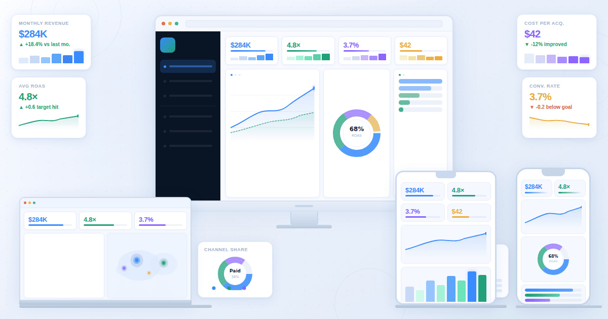
This category flips the model. The user describes what they need in plain language. "Build me a SaaS metrics dashboard tracking MRR, churn, and expansion revenue segmented by cohort." The platform interprets that description, connects it to the available data, and builds the complete dashboard with the right charts, KPIs, and layout.
The practical difference shows up in time and scale. A traditional BI dashboard for a new data source takes hours of configuration, assumes the builder knows which metrics to include, and requires rebuilding from scratch when requirements change. A platform built on this principle produces the same output in minutes and adjusts when you change the description.
How Generative Analytics Differs From Predictive Analytics
The terms sound similar but describe entirely different things. Predictive analytics forecasts future outcomes from historical data. A predictive model analyzes past churn patterns to estimate which customers are likely to leave next quarter. It tells you what will probably happen. The interface that surfaces that forecast is still built the old way: by a person, in a tool, one chart at a time.
This type of platform doesn't forecast. It generates the analytics interface itself. A generative analytics platform takes your data and your description of what you need to see, and produces the dashboard or report that makes that data visible. The AI isn't predicting a business outcome. It's building the view that lets you monitor any outcome you care about.
You can combine them. A predictive model outputs a churn probability score for each customer. A generative analytics platform takes that predictive output and generates the dashboard that surfaces at-risk customers in a format your customer success team can act on. Predictive analytics produces the insight. The platform produces the interface that makes the insight accessible.
What the Workflow Change Actually Looks Like
The difference between traditional BI and this approach is not just speed. It's a different relationship between the person who needs the data and the person who builds the view of it. Most analytics bottlenecks are not data problems. They are access problems.
In a traditional BI setup, a business user with a question goes to an analyst, explains what they need, waits for the analyst to build a report or dashboard, reviews it, requests changes, and waits again. The analyst is the translator between the business question and the data. This works, but it creates a bottleneck. Every new question requires analyst time, and analytical capacity is finite.
In this workflow, the business user describes what they need directly to the platform. A marketing manager building a campaign performance view, a finance team running month-end close, a product manager tracking feature adoption: each describes their specific need and gets a dashboard built from their data without involving an analyst for the interface layer. Analysts still own the metric definitions and data quality. They no longer own the presentation layer.
The second change is iteration speed. If a metric doesn't belong on the dashboard, you remove it from the description. If you need a new segment, you add it. The dashboard regenerates. On a traditional BI platform, that same change requires opening the editor, finding the correct chart, modifying the configuration, checking the result, and republishing. This approach compresses that cycle into a conversation.
Generative BI vs Generative Analytics
Generative BI is a related term used by some business intelligence platforms to describe natural language query features. You ask a question about your data in plain English and the BI tool returns a chart or table answering that question. It's a useful capability.
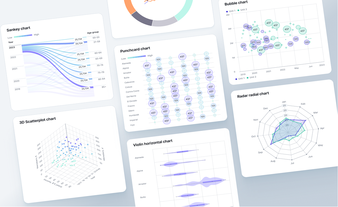
The broader category is generative analytics. Natural language data queries are one feature of this type of platform, but the category covers the complete analytics output: dashboards with multiple views, real-time monitoring, executive reports, AI-generated charts, and KPI summaries. Where generative BI often focuses on answering a single question with a single visualization, the platform generates a complete analytics workspace from a description of what a team needs to see on an ongoing basis.
The distinction matters for teams evaluating platforms. A generative BI feature inside a traditional tool gives you natural language query on top of a manually configured environment. A full platform in this category means the entire environment generates from your description, covering not just individual answers but the full dashboard architecture your team monitors every day.
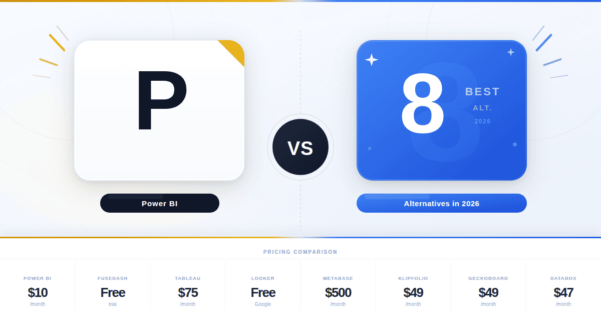
This is the distinction that matters when comparing options like Power BI's Copilot, Tableau Pulse, or ThoughtSpot's AI features against purpose-built generative analytics platforms. Those tools are genuinely useful for teams already deeply invested in their ecosystems, and their AI features reduce the friction of working with data that someone has already configured and modeled. That is a real benefit for certain workflows.
What they do not do is replace the configuration requirement itself. Those AI features layer natural language capability on top of a traditional BI architecture that still requires manual dashboard configuration, data model setup, and template management.
They answer questions about data that someone else already organized into a configured environment. A generative analytics platform generates the environment itself. The starting point is your data and a description. The ending point is a live dashboard. There is no configuration step in the middle that a human has to complete first.
What Generative Analytics Looks Like in Practice
Fusedash is built on the Model Context Protocol (MCP), which means teams can connect the AI model of their choice (Claude, GPT, or any MCP-compatible model) without being locked into a single vendor. That model-agnostic architecture is what makes the following kinds of deployments practical across different data environments.
SaaS company, RevOps team
A head of revenue operations describes a dashboard: "Show me MRR, net revenue retention, expansion by cohort, and churn rate segmented by plan type, with a 12-month trend for each." The platform connects to the product database and CRM, then generates that dashboard in minutes.
The RevOps team filters by cohort, asks follow-up questions through a data chat interface, and shares the view with the executive team. No analyst built the layout. No BI developer configured the data connections for each chart individually.
Manufacturing company, finance team during monthly close
A controller at a 300-person company describes what the close dashboard needs: "Budget versus actual by department, AR aging, forecast variance, and close task status." The platform generates an operational dashboard that updates as journal entries post. The controller monitors close progress without pulling data from three separate systems into a spreadsheet.
CEO at a 150-person company, weekly business review
This is the example most organizations have not yet built but spend the most time producing manually. A CEO wants a weekly business review showing revenue trend, pipeline coverage, headcount vs plan, gross margin, and cash position, all current as of Monday morning.
In a traditional setup, someone on the finance or operations team assembles this from four or five systems every Sunday night, pastes it into a slide, and sends it before 9am. In a generative analytics setup, the CEO describes the view once. The platform connects to the accounting software, CRM, and HRIS, and the numbers are current when the CEO opens their laptop on Monday. Nobody assembled it. Nobody sent it. It was already there.
Common Misconceptions About Generative Analytics
Three things get conflated with generative analytics regularly, and all three lead to incorrect expectations about what the category actually delivers.
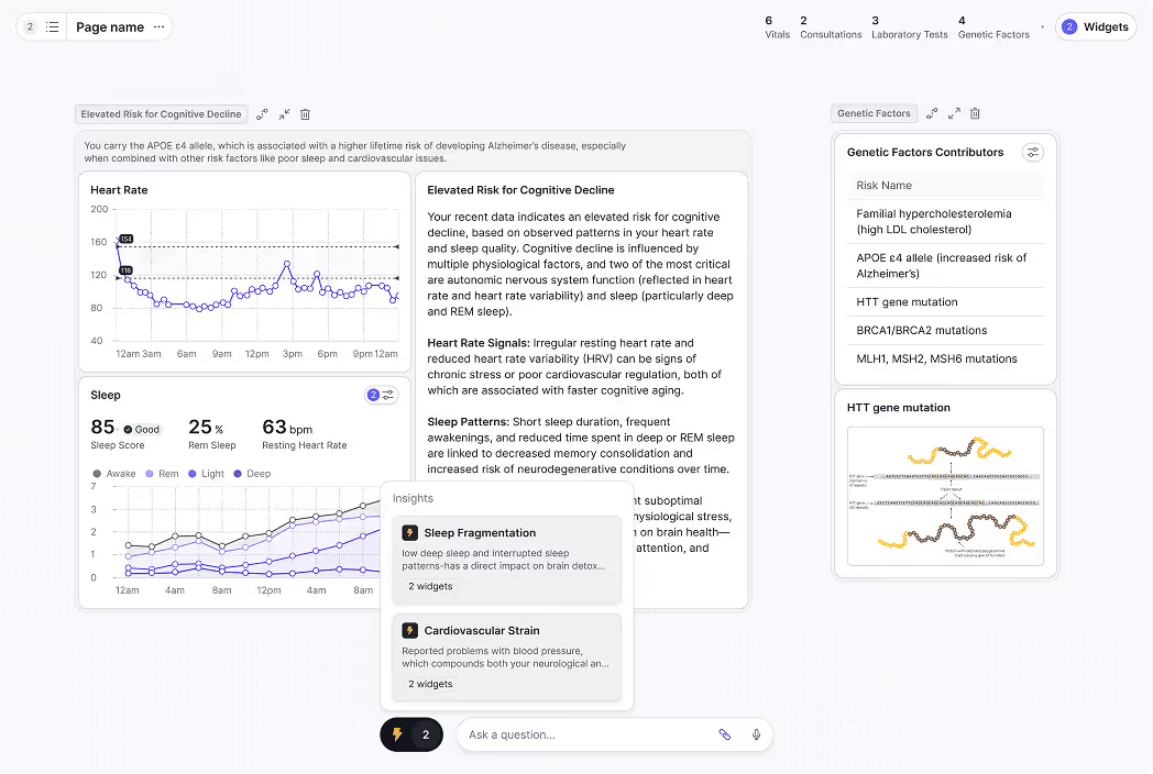
It does not replace your data. These platforms work with the data you already have. The platform does not generate fictional metrics or fill gaps with synthetic data. If the underlying data source doesn't contain a metric, the dashboard cannot show it. The generation happens at the interface layer, not the data layer.
It is not the same as an AI chatbot for data. Most data chatbots and generative AI for data analytics tools answer individual questions with single charts. This approach produces persistent, structured dashboards that teams check regularly, share with stakeholders, and build their operational rhythm around. The data chat feature is one component, not the whole category.
It does not remove the need for metric definitions. Analysts and data teams still define what a KPI means, how it's calculated, and which data source it comes from. The platform handles the presentation of those definitions across different audiences and formats. The logic layer still requires human expertise.
The value of generative analytics is not that it removes analysts from the picture. It removes the manual assembly work that kept business users waiting and kept analysts doing repetitive presentation work instead of harder problems. The organizations that get the most from this category are the ones where analysts own the metric definitions and business users get direct access to the views they need without having to ask.