A financial dashboard is a single-screen view of an organization's key financial metrics, updated automatically from connected data sources. It replaces pulling numbers from multiple reports and gives finance leaders a real-time picture of where the business stands. It connects from your accounting software, ERP, or CRM, so the numbers are current when you open it.
Most financial dashboard guides treat CFOs and finance teams as the same audience. They're not. A CFO needs a strategic pulse check readable in 10 seconds. A finance manager needs an operational control center built for the monthly close. This article covers both.
The CFO Dashboard: What Goes on the Strategic View
A CFO dashboard is not an analytics tool. It's a signal board.
You're not opening this dashboard to explore data. You're opening it to answer one question in 10 seconds: is the business performing as expected this month? If the answer is yes, you move on. If the answer is no, you know which metric triggered the concern and hand it to the finance team to investigate.
If a metric requires context to be meaningful, it belongs on the finance team dashboard, not here.
Revenue vs forecast. Actual revenue this month compared to the plan set at the start of the period. The signal is direction and magnitude: on track, ahead, or behind, and by how much. A 5% variance is a conversation. A 15% variance is a board agenda item.
Gross margin trend. Gross profit as a percentage of revenue, shown as a 12-month trend line. A single bad month is noise. A downward trend that started three months ago is something else. This metric is most useful when it moves in a direction the revenue line does not explain.
Operating cash flow. Cash generated from operations this period, compared to last period and to plan. This tells you whether the business is self-funding or drawing down reserves. For companies with debt covenants, a sustained decline can trigger legal obligations before it surfaces in a board discussion.
Cash runway. For growth-stage companies and organizations carrying significant debt: how many months of operating capacity remain at current burn. The signal is a number, not a trend. Under 12 months warrants a conversation. Under 6 months warrants an action plan.
Pipeline coverage. Sales pipeline value as a multiple of the revenue target for the next quarter. Standard benchmark: 3x is healthy for most B2B businesses. Below 2x signals a top-of-funnel problem that will appear in revenue in 60 to 90 days. This belongs on the CFO view because by the time it shows in the revenue line, it is too late to act.
EBITDA margin. Operational profitability as a percentage of revenue. CFOs use this to assess whether cost decisions this period are sustainable relative to the revenue line. A widening gap between revenue growth and EBITDA margin growth is the earliest warning of a cost structure problem.
Headcount vs plan. Actual headcount compared to the hiring plan, with total personnel cost as a percentage of revenue. Overhiring is the most common driver of unexpected cost variance in growth companies, and it needs to be visible before it appears in the P&L.
A finance dashboard built for CFO use should show all seven of these in a single view with no scrolling required.
The Finance Team Dashboard: What Goes on the Operational View
The finance team's dashboard is built for the monthly close, not the board meeting.
The finance manager and controller are using this screen to find the number that's wrong, understand why it's wrong, and fix it before the books close. Every metric here supports one of three questions: where's the variance, what caused it, and is it resolved?
Budget vs actual by department. Actual spend compared to approved budget for each cost center, with variance shown in absolute and percentage terms. A summary showing marketing is 18% over budget is a starting point. The line items underneath tell you whether it is a timing issue or a real overspend, which is why drill-through from department total to line item matters here.
Forecast variance. The gap between the forecast made at the start of the month and the actual outcome. Finance teams track this to evaluate forecasting accuracy over time. A team that consistently forecasts 20% high on a specific cost category has a process problem, not a data problem.
AR aging. Accounts receivable broken down by days outstanding: current, 30-day, 60-day, and 90-day-plus. The signal is movement in the 60-day and 90-day-plus buckets. Receivables aging into those brackets is a cash flow problem that will appear on the CFO's operating cash flow metric within a quarter.
Days sales outstanding (DSO). Average days from invoice to cash collection. A rising DSO trend over three consecutive months warrants a collections process review regardless of where the absolute number sits relative to industry benchmarks.
AP liability and payment schedule. Outstanding accounts payable with due dates, organized by what is due this week versus next. Finance teams use this during close to manage cash outflows and avoid late payment penalties on obligations that fall between report cycles.
Payroll accuracy. Total payroll cost this period compared to plan, with headcount reconciliation. A 1 to 2% variance at the scale of a 200-person company represents six figures in unplanned cost, and catching it during close is better than explaining it in the board pack.
Close task completion. The percentage of month-end close tasks completed versus outstanding, with due dates and owner assignments. This is a workflow metric, not a financial one. But it belongs on the finance team dashboard because the close isn't finished until every line is reconciled and signed off.
Banks, investment firms, and insurance companies carry additional regulatory reporting requirements that expand this list to include capital adequacy ratios, liquidity coverage, and compliance status. Teams in regulated industries often need a financial services dashboard that incorporates those metrics alongside operational ones.
Three Financial Dashboard Examples
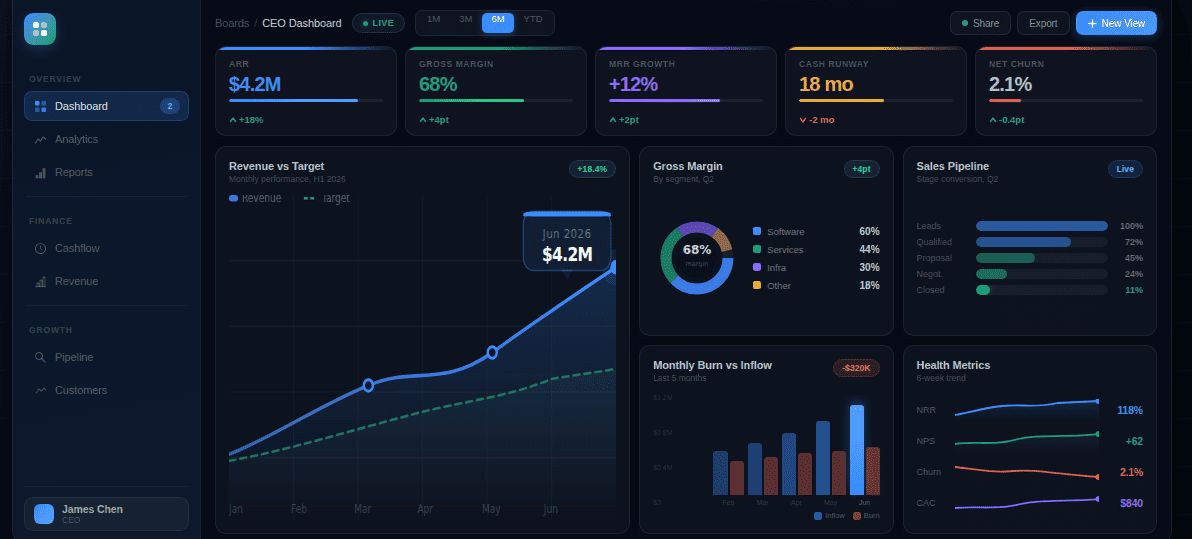
Example 1: CFO dashboard for a 50-person SaaS company
The screen has two rows. Top row: three KPI cards showing MRR at $412K versus $430K plan (-4.2% in red), gross margin at 72% flat against the trailing three-month average, and cash runway at 14 months at current burn. Second row: a trailing 12-month revenue chart with the plan line overlaid, and a pipeline coverage gauge sitting at 2.8x against a 3x target, flagged amber.
Five elements. No scrolling. You open it before the Monday leadership meeting and know in 8 seconds that revenue is slightly behind plan, margin is holding, and the business has significant runway. The amber pipeline signal tells you where to focus the sales conversation this week. A platform like Fusedash generates this view from a description of what the CFO needs to see, without an analyst building charts manually for each new KPI that gets added.
Example 2: Finance team dashboard for a 200-person manufacturing company during monthly close
Main area: budget vs actual table for all departments with a variance column sorted by magnitude. Three rows are highlighted red: marketing at +18%, facilities at +12%, and R&D at +7%. Top right: AR aging showing $240K in the 60-day-plus bucket, up from $180K last month. Left panel: close checklist showing 14 of 18 tasks complete, with four outstanding items listed by owner name and due date.
The controller uses this on day four of a five-day close. The marketing variance needs an explanation before it goes in the board pack. The AR jump needs a collections call before the cash flow forecast gets updated. The checklist tells them exactly which four tasks are still open and who owns them.
Example 3: CFO dashboard for a regional bank
Top row: three metrics with trend indicators. Net interest margin at 3.2%, down 8 basis points from last quarter. Loan-to-deposit ratio at 82%, within the board-approved policy range of 75 to 90%. Non-performing loan ratio at 1.1% of total loans, up from 0.9% last quarter, flagged amber. Second row: deposit growth by product type for the trailing six months, and a liquidity coverage ratio indicator showing regulatory compliance status.
The CFO uses this at the weekly risk committee meeting. The NIM compression and the rising NPL ratio are the two items that need commentary. Everything else is within policy range.
What Makes a Financial Dashboard Actually Useful
It shows the signal, not the data. A financial dashboard isn't a report. A report shows all available financial data. A dashboard shows the metrics that require a decision or an action. If a metric is on the dashboard and nobody has ever responded to a change in it, it doesn't belong there.
It updates without human intervention. A dashboard that requires someone to paste in new numbers each month is a spreadsheet with better formatting. The value is that the numbers are current the moment you open it, not current as of last Thursday when someone last ran the export. Connecting data sources directly to the dashboard layer eliminates the update cycle and makes the numbers trustworthy.
It separates the CFO view from the finance team view. A single dashboard trying to serve both audiences serves neither well. CFOs need 6 to 10 high-level indicators they can read in one pass. Finance teams need granular operational metrics with the ability to click through to line-item detail. One screen trying to do both usually ends up with 25 metrics, no clear hierarchy, and two audiences who stop using it.
It lets users ask follow-up questions. A CFO who sees margin compression needs to know where it happened: which product line, which region, which cost category. That question should be answerable within the dashboard through interactive charts that respond to filtering in real time, or through a data chat interface where the question is asked in plain language and the answer comes back as a visualization. Tools like Fusedash handle both through cross-filtering that recuts every chart by the selected dimension and a data chat that answers follow-up questions without the finance team rebuilding a view.
It has an owner and a review cadence. The most common reason financial dashboards stop being used is that nobody is responsible for maintaining them. KPI definitions drift, new product lines get added without new metrics, and a data connection breaks without anyone noticing. A useful financial dashboard has one named owner and a quarterly review to confirm the metrics still reflect the decisions being made.
The most common financial dashboard failure isn't technical. It's organizational: building for the wrong audience, including metrics nobody acts on, or treating the CFO view and the finance team view as the same problem. Getting the audience right before the metrics is the step most implementations skip.
A financial dashboard your CFO checks before every board meeting and your finance team uses to run close isn't a reporting tool. It's the infrastructure that lets your finance function operate at the speed decisions actually require.