The best Tableau alternative depends on why you're leaving. For most teams, Power BI cuts the cost while keeping the analytical depth. Fusedash generates interactive dashboards from a plain-language description without any BI configuration. Looker Studio is the free option for Google-connected reporting. ThoughtSpot and Metabase each solve more specific problems. Here's what each one does and who it's actually for.
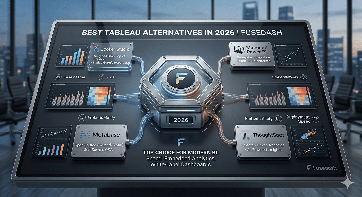
The best Tableau alternatives in 2026:
- Power BI: Best overall alternative for teams already in the Microsoft ecosystem
- Fusedash: Best for AI-generated dashboards without a BI analyst to build or maintain them
- Looker Studio: Best free alternative for teams working with Google Analytics or Ads data
- ThoughtSpot: Best for search-driven, conversational data exploration at enterprise scale
- Qlik Sense: Best for associative data exploration where metric relationships matter
- Metabase: Best open-source alternative for technical teams that can self-host
- Zoho Analytics: Best mid-market alternative combining AI exploration with accessible pricing
- Sigma Computing: Best for SQL-literate teams that want a modern spreadsheet-style interface
Keep reading for the full breakdown and how to choose.
What Is the Best Tableau Alternative?
For most teams, Power BI. It covers 80% of what Tableau does, integrates directly with Microsoft 365, and costs less than half the price for builders. For teams without a dedicated data analyst, Fusedash is the stronger choice: it generates interactive views from a description rather than requiring someone to build and maintain them.
Why Teams Leave Tableau
Tableau is a capable platform. Teams leave it for four consistent reasons.
Cost. Builder licenses start at $42/user/month and reach $75/user/month at the Creator tier. For teams with five or more dashboard builders, that's a significant line item against platforms that charge $10–15/user/month or nothing at all.
Analyst dependency. Tableau requires a skilled BI resource to build and maintain dashboards. Business users can explore views, but they can't build them without training. Teams without dedicated analytics staff find the tool underused, paying for capabilities that only one or two people can actually operate.
Time to insight. Even experienced Tableau users spend meaningful time on configuration. A new dashboard request typically takes days from submission to delivery. For fast-moving teams that need answers in hours, that lag is a real operational constraint.
Complexity for simple use cases. Tableau's depth is also its weight. Teams that primarily need to share clean, interactive reports with clients or stakeholders find the tool's learning curve out of proportion to what they're actually trying to do.
Quick Comparison: 8 Tableau Alternatives at a Glance
Tool-by-Tool Breakdown
Power BI: Best Overall Tableau Alternative
What it does: Microsoft's BI platform produces interactive dashboards with deep Microsoft 365 and Azure integration, AI-assisted exploration through Copilot, and streaming data support.
Why teams switch from Tableau: Power BI Pro costs $10/user/month versus Tableau's $42–75/user/month. For teams already using Excel, SharePoint, or Azure, the integration is immediate. Copilot reduces the technical barrier for building views by letting users ask natural language questions about their data.
Honest limitation: DAX formula complexity is a real barrier for advanced metrics. Copilot's full feature set requires the Premium Per User license at $24/user/month. Teams coming from Tableau often find the interface less polished for custom visualization work.
Best for: organizations already running on Microsoft 365 or Azure, and teams that need solid BI depth at a significantly lower cost than Tableau.
Pricing: Pro at $10/user/month; Premium Per User at $24/user/month. See Power BI pricing.
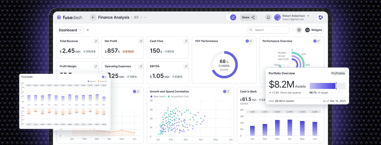
Fusedash: Best for AI-Generated Dashboards Without a BI Analyst
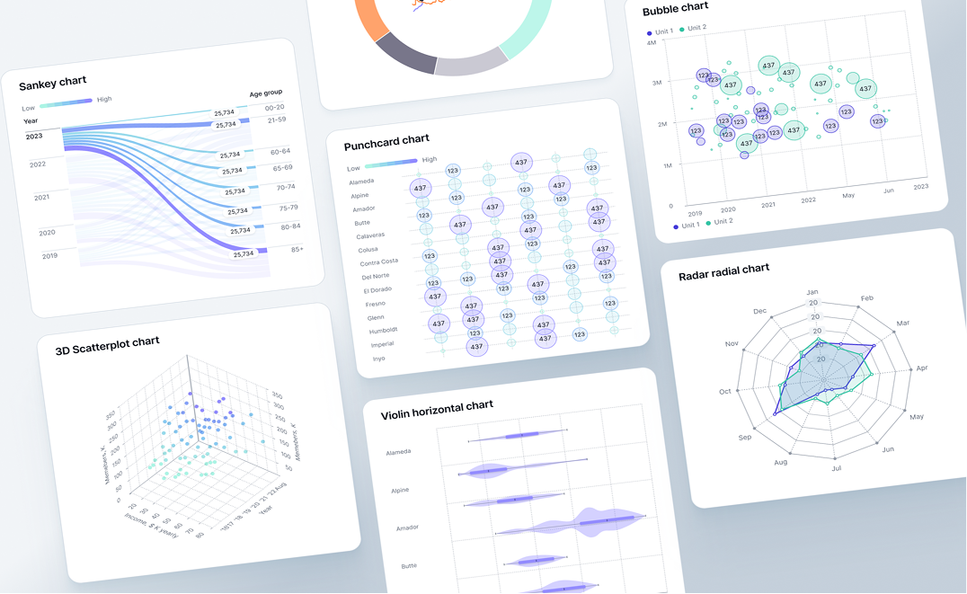
What it does: Fusedash is a generative analytics platform that produces complete interactive dashboards from a plain-language description. Filters, drill-downs, KPI logic, and anomaly detection are built in automatically. It runs on Model Context Protocol (MCP), so teams connect the AI model they prefer (Claude, GPT, or any compatible model) rather than being locked into one provider.
Why teams switch from Tableau: Tableau requires a BI analyst to configure every dashboard. Fusedash eliminates that dependency. A marketing director, SaaS founder, or operations manager can build interactive dashboards from their own data without submitting a request to a data team. The time from "I need to see this" to seeing it drops from days to minutes.
Honest limitation: fewer pre-built connectors than Tableau. Works best with CSV exports, REST APIs, and MCP-connected sources rather than complex multi-source SQL environments requiring custom joins.
Best for: business teams, agencies, and SaaS companies that need fast, accurate interactive dashboards without a dedicated BI analyst to build and maintain them.
Pricing: free trial available; AI features use token-based pricing.
Looker Studio: Best Free Tableau Alternative
What it does: Google's free web-based reporting tool connects to Google Analytics, Ads, Sheets, BigQuery, and hundreds of third-party sources to produce shareable interactive reports.
Why teams switch from Tableau: It's free, requires no technical setup, and produces shareable interactive reports that recipients can filter and explore without a login. For teams whose primary data lives in Google's ecosystem, it covers most of what they'd actually use Tableau for.
Honest limitation: no AI exploration, no natural language querying, no cross-chart filtering on click. Interactivity is limited to display controls. Performance degrades with large datasets.
Best for: digital marketers and small teams working primarily with Google Analytics, Ads, or Sheets data.
Pricing: free. See Looker Studio. Pro version available as part of Google Workspace at $9/user/month.
ThoughtSpot: Best for Search-Driven Exploration
What it does: ThoughtSpot is a search-first analytics platform where users explore data by typing business questions. Liveboards update continuously, and the Spotter AI surfaces trends and anomalies proactively.
Why teams switch from Tableau: ThoughtSpot removes the distinction between building a dashboard and asking a question. Any user with data access can type a question and get a visualization back in seconds, without a pre-built report.
Honest limitation: enterprise-scale pricing with no public rate card makes evaluation expensive in time and budget. Connecting data sources requires technical implementation.
Best for: enterprise teams that need self-service exploration at scale and can justify significant spend for the depth of AI-assisted analysis.
Pricing: custom enterprise pricing; contact ThoughtSpot for a quote.
Qlik Sense: Best for Associative Data Exploration
What it does: Qlik Sense uses an associative analytics engine that shows selected and excluded values across every connected chart when you click a data point, revealing relationships that predefined drill paths miss.
Why teams switch from Tableau: Qlik's associative model lets users discover unexpected connections in data rather than only following paths that were designed in advance. For teams that need to explore relationships across many variables, this is a genuine capability difference.
Here's what that looks like in practice. A sales analyst clicks a region in a revenue chart. In Tableau, the other charts update to show data for that region, exactly what you configured them to do. In Qlik, every connected chart updates, and the values excluded from that region are grayed out across every visualization. If a particular product category has zero sales in the selected region, Qlik surfaces that absence immediately. You see not just what's there, but what isn't. That kind of negative-space analysis requires building specific views in Tableau. In Qlik it's the default.
Honest limitation: the associative model takes time to learn. Grayed-out values are frequently misread as errors by new users, and onboarding takes longer than most comparably priced tools.
Best for: organizations where the connections between metrics matter as much as the metrics themselves.
Pricing: Qlik Sense SaaS starts at approximately $30/user/month; enterprise pricing varies.
Metabase: Best Open-Source Alternative
What it does: Metabase is an open-source BI tool for querying databases, building interactive dashboards, and sharing results via public links or embedded components, with a free self-hosted version.
Why teams switch from Tableau: Metabase is free for teams that can self-host, requires no per-seat licensing, and lets non-technical users build queries through a visual interface without writing SQL. For startups and technical teams that want control over their analytics stack, it removes cost as a barrier entirely.
Honest limitation: the free version requires a developer to set up and maintain the server. SAML auth, data sandboxing, and usage analytics require the paid cloud version. No AI exploration or natural language querying.
Best for: technical teams that want self-hosted control and startups that need interactive reporting without licensing costs.
Pricing: free (open-source, self-hosted); Metabase Cloud at $500/month. See Metabase pricing.
Zoho Analytics: Best Mid-Market Alternative
What it does: Zoho Analytics combines interactive dashboards, AI-powered exploration through its Zia assistant, and integration with the Zoho product suite and external data sources.
Why teams switch from Tableau: Zoho Analytics starts at $24/month for two users, versus $42 to $75 per user per month for Tableau builders. It includes an AI assistant that handles natural language queries and works well for teams already using Zoho CRM or other Zoho products.
Honest limitation: works best within the Zoho ecosystem. Teams using Salesforce, HubSpot, or other non-Zoho CRMs may find data integration more cumbersome than Power BI or Tableau.
Best for: mid-market teams that need AI-powered exploration and self-service dashboards without enterprise-level pricing.
Pricing: starts at $24/month billed annually for two users; scales based on user count and row limits.
Sigma Computing: Best for SQL-Literate Teams
What it does: Sigma is a cloud-native analytics platform that gives SQL-literate teams a spreadsheet-style interface for exploring data warehouse data, with live connections to Snowflake, BigQuery, and Redshift.
Why teams switch from Tableau: Sigma lets data teams work at data warehouse scale with the familiarity of a spreadsheet interface. Analysts who think in SQL find Sigma's live exploration model faster than Tableau's publish-and-refresh cycle for large datasets.
The "live warehouse exploration" distinction matters operationally. In Tableau, a data engineer extracts data, models it, publishes a workbook, and schedules refreshes. Analysts work from that published snapshot. In Sigma, analysts connect directly to the data warehouse and explore the live table, with no extract, no refresh window, and no middleman workbook. For teams running dbt models on Snowflake or BigQuery, that means exploring results within seconds of a model run completing, not waiting for the next scheduled Tableau extract. It also means analysts can write or reference SQL directly in the same interface where business users are doing spreadsheet-style exploration.
Honest limitation: non-technical users can explore, but building useful workbooks requires SQL literacy. It's not a self-service tool in the way Tableau positions itself. Setup requires a modern cloud data warehouse.
Best for: data teams and analytics engineers wanting a modern cloud-native interface for warehouse-scale exploration.
Pricing: starts at approximately $35/user/month; enterprise pricing varies.
How to Choose the Right Tableau Alternative
The right switch depends on the specific reason you're leaving Tableau.
If cost is the primary issue and you're in the Microsoft ecosystem, Power BI is the straightforward answer. The per-user savings are immediate, the integration with existing Microsoft tools is genuine, and the analytical depth is comparable for most business use cases.
If cost is the issue and you don't have Microsoft infrastructure, Looker Studio handles most reporting needs for free if your data lives in Google Analytics, Ads, or Sheets. Metabase is the free option if you need direct database connectivity and have a developer to maintain it.
If analyst dependency is the real problem, the tools above mostly don't solve it. Power BI still requires a BI resource to build dashboards. Looker Studio still requires manual configuration. If the core issue is that your business users can't build their own views without submitting requests, see how Fusedash works. That's the specific problem it's built to solve.
If your team needs to explore data without predefined reports, ThoughtSpot or Qlik Sense are the tools to evaluate. ThoughtSpot works better for business users who want to ask questions in plain language. Qlik works better for analysts who want to explore relationships across dimensions without building drill paths in advance.
The most useful evaluation is running the tool against your actual data. Most platforms here offer a free trial or free tier. Build the view your team references most often, measure how long it takes, and whether it required a BI analyst or not. That tells you more than any feature list.
The right Tableau alternative isn't the one with the most features. It's the one that matches how your team actually works. If you have dedicated BI staff and need enterprise-grade visualization, Power BI or Qlik will serve you well. If you need business users to own and generate their own views without analyst support, that's a different problem that most of these tools don't solve. The tool that gets your team to a working answer with data you already own, without a ticket queue, is the right switch. See how Fusedash handles it.