"We've seen a 40% jump in traffic since last month. That's great news," a marketing professional might tell their team lead. But when the lead asks why the traffic increased, charts alone rarely provide the full answer.
This is where data storytelling comes in.
Data storytelling is the practice of combining data, visuals, and narrative to explain what the numbers mean and why they matter. Instead of presenting isolated charts or metrics, it connects the dots to show the bigger picture and guide better decision-making.
Why Charts Do Not Drive Decisions Alone
Charts look good, and they might make you falsely believe that an increasing graph line is enough to make a business decision. Why won't they? Charts are essentially the first step of data visualization storytelling, creating a convincing argument about the next step that should be taken.
But charts represent only the first step. Patterns aren't enough to make business decisions. They don't give the context behind them, nor do they provide insight into the action that one must take to fix it or sustain its momentum.
Context Gap
What do you see when a chart line is going up? In marketing, you may think of a traffic chart or a bounce rate chart. In the context of finance, a rising line may indicate a surge in profits or a rise in the customer churn rate.
Same pattern, different meaning. But will the reader always know the difference?
That brings us to the first limitation of the chart: the context gap. Without the context, you may not know whether the increase is positive, what to expect from it, or whether it is something negative.
Action Gap
Suppose you know what the chart represents. The increasing bounce rate means that people are leaving your website quickly, and the increasing churn rate means your customers are leaving. Panic goes up, but would you know what to do?
No. And that brings us to the second limitation of the chart: the action gap.
Since there is no context, there is no information about why the chart is behaving this way. When there is no answer to the why, there is no answer to "who is responsible?"
And when there is no answer about who is responsible, there is no answer to "what action to take."
The 5-part story
Charts don't give context or action. Narratives, however, can fill these gaps. As the reader moves through the motions of this story, they learn about context, the change, the root cause of the change, the impact of the change, and what action to take.
Those are the five elements of data storytelling, explained below through a fictional story of a marketing company whose CAC increased drastically inone quarter.
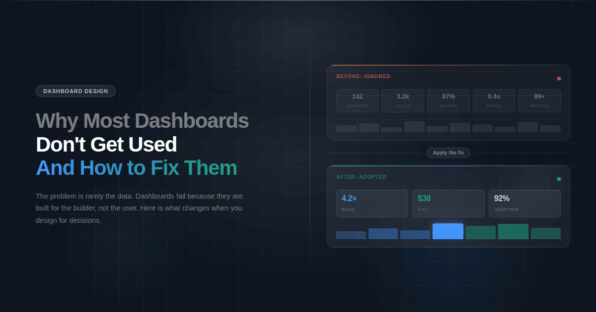
Marketing company XYZ maintained a stable customer acquisition cost (CAC) of $150 for six months. However, one day, the marketing lead looked at the dashboard and noticed that it had jumped to $220 in the fourth quarter.
To explain what happens next, let's go into the five-part story that gave the company heads a clear idea of what to do.
This 5-part approach to storytelling with data could be considered the strongest narrative structure as it leaves no ambiguity and no decision chokepoints.
The Insight Statement Formula
If we are to condense the insight statement into a formula, the following would suffice.
"[Metric] changed because [X], impact is [Y], next action is [Z]."
The statement alone turns a simple observation, such as "revenue is down," into insight about why it happened, what caused it, and what it is costing the business, crafting a mini story.
But this statement relies on precision, which means that each element should provide tangible information, not vague words. Let us go one by one into each and explain what it means:
- Metric changed: Be specific about the numbers. For example, instead of just saying "revenue is down," say, "revenue is down by 18%."
- The Root Cause (X): Find the actual cause of the change, not just the correlation. For example, instead of saying "because fewer people visited the website," say "because we paused organic marketing due to low budget."
- The Impact (Y): Don't just give the metric, translate it into time, dollars, and strategic risk. For example, instead of saying, "Churn rate will increase by 10%," say, "This will cost us $500K in ARR if sustained through Q2."
- The Next Action (Z): Be specific about the action and who or what to assign it to. For example, instead of a vague statement such as "we should improve marketing," say "we should reallocate $10K from social to Google Ads and launch a rewards campaign by Friday."
Annotation and Callouts
Putting effort into chart storytelling is only worthwhile if the user gets it. Just placing the fluctuations in front of the viewer and putting other story elements leaves the reader’s brain to do the heavy work.
What you need is to guide the viewer to grasp the story the way you want.
Annotations serve as visual highlights, guiding the viewer’s eye so nothing is left to interpretation. That way, you do the thinking for the viewer.
Below are the 6 core annotation tactics to implement in your data storytelling approach:
The 6 Core Annotation Techniques
Arrows and pointers
- What they are: Visual markers highlighting the exact moment something happened
- How to use them: Point to single events like product launches, competitor moves, or campaign starts
- Example: Arrow pointing to a spike labeled "Black Friday sale launched" or arrow at a drop marked "Competitor launched product – May 15"
- Best placement: Position arrows above spikes and below drops for clean, unobstructed reading
Shaded regions
- What they are: Colored zones highlighting extended time periods when conditions changed
- How to use them: Mark sustained periods like seasonal trends, testing phases, or operational disruptions
- Example: Gray box over Q4 labeled "Holiday season surge" or light red zone over two weeks marked "Website downtime"
- Best style: Use subtle background shading (10–20% opacity) so data lines remain clearly visible
Reference lines
- What they are: Horizontal or vertical benchmarks that show targets, averages, or thresholds
- How to use them: Display goals, industry standards, or acceptable performance ranges for instant comparison
- Example: Dotted horizontal line at "$50k monthly revenue goal" or dashed line showing "Industry average churn: 5%"
- Best style: Use dotted or dashed patterns to distinguish from actual data, with clear labels at line endpoints
Color emphasis
- What they are: Strategic use of bold colors to highlight priority data while fading everything else
- How to use them: Make critical segments pop while rendering non-essential data in neutral tones
- Example: Highlight the underperforming North region in red while showing all other regions in light gray
- Best approach: Follow the one-color rule: Emphasize one thing in vibrant color, make everything else neutral
Callout boxes
- What they are: Text containers that provide context or explanations directly on the chart
- How to use them: Explain the "why" behind data changes without forcing viewers to reference external text
- Example: Box near CAC spike stating "Google Ads CPC increased 40% + organic content paused" with a connecting line to the data point
- Best placement: Position near relevant data with a thin connecting line, using borders to separate from the chart background
Data labels on key points
- What they are: Precise numerical values displayed at critical moments in your data
- How to use them: Show exact figures at turning points, peaks, valleys, and the current state instead of forcing the Y-axis estimation
- Example: Label the peak "412 signups (June)" and current state "287 signups (Dec)" or show "Current: 18%, Goal: 25%"
- Best practice: Label only significant points to avoid visual clutter while maintaining clarity
The 1-page story template
The best data stories are brief, fit on one page, and contain no fluff. Below is the template you can use across every space, from executive dashboards and email to Slack and slide decks.
Examples: 3 mini stories
Here are three small examples of three different industries.
Marketing
Marketing stories track acquisition performance: how efficiently you turn budget into customers, which channels are winning or failing, and whether campaign changes are improving or destroying your cost per lead and conversion rates.
Finance:
Finance stories focus on revenue health: tracking churn, expansion, customer lifetime value, and cash flow to reveal whether your business model is strengthening or deteriorating and what risks threaten key milestones.
Operations
Operations stories expose delivery breakdowns: highlighting where internal processes (fulfillment, support, production) fail to meet customer expectations, creating bottlenecks that damage NPS and increase costs.