.png)
Dashboard software has been around for decades. What changed is generation. An AI dashboard connects to your data and generates complete charts, KPI views, and layouts from a natural language description you type. There's no drag-and-drop configuration. No SQL. You describe what you need, and the platform builds it. The output is a live, interactive view of your data, ready to share in minutes.
If you're a marketing manager, finance director, or operations lead thinking about moving beyond traditional BI, this article covers the precise definition, explains how the generation process works in practice, shows when AI dashboards outperform traditional tools, and compares the leading platforms available in 2026.
What Exactly Is an AI Dashboard?
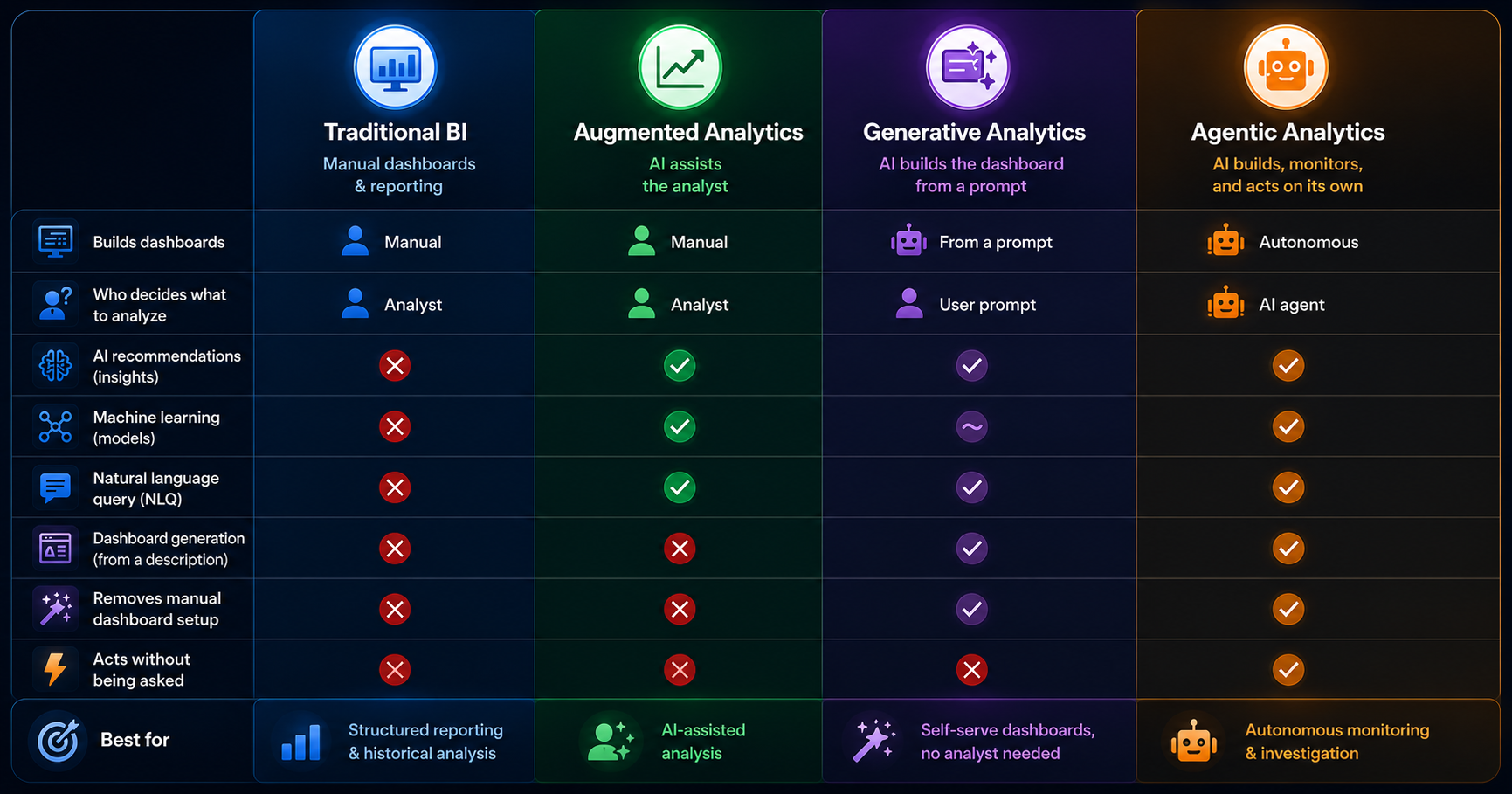
Most dashboard tools today include some form of AI, but there's a meaningful gap between AI-assisted and AI-generated, and understanding that gap changes how you evaluate platforms.
AI-assisted dashboards, like Microsoft Copilot inside Power BI, let you ask questions and get chart suggestions. You still configure the dashboard yourself. The AI helps you work faster. It doesn't do the work for you.
AI-generated dashboards work differently. You type a description of what you need, and the platform creates the complete layout, selects appropriate chart types, defines the KPI logic, and produces a working, interactive view. You described your goal, and the platform built it.
In practice, that means a marketing director can type "show me ROAS by channel versus last quarter with weekly trending" and get a finished dashboard within minutes. No analyst required. No three-day wait for someone else to build a view.
The distinction matters because it changes who can act on data. AI-assisted tools still require someone technically capable to build and interpret the output. AI-generated tools deliver the answer directly to the person who asked the question, regardless of their technical background.
"An AI dashboard doesn't replace your data. It replaces the work between your data and your decisions."
That shift doesn't just speed up your analytics process. It changes who owns it, and that matters more to most organizations than any gain in speed alone.
AI Dashboard vs Traditional BI Dashboard
The core difference is this: a traditional BI dashboard requires a trained professional to build it from scratch, while an AI dashboard generates from a description you type in minutes.
Traditional BI tools still make sense in specific situations. Organizations managing complex data models with custom SQL joins, multi-source pipelines, or strict regulatory governance requirements genuinely need tools like Tableau and Power BI. Dedicated data engineering teams often value the granular control that manual configuration gives them.
AI dashboards win where speed and team independence matter most. A finance director who needs a budget variance view today can't wait three days for a ticket to clear. If your primary need is accurate answers from your core metrics, and your team doesn't have a dedicated analyst available to build views on demand, an AI dashboard removes that bottleneck entirely.
How an AI Dashboard Generates Your View in 5 Steps
An AI dashboard follows a consistent generation process regardless of the platform. Here's what happens between "I have data" and "I have a working view."
Step 1: Connect your data source. Upload a CSV, connect a REST API, or link an MCP-compatible AI model. One connection powers your entire workspace. Dashboards, charts, maps, and reports all draw from the same source, without reconnecting for each output type.
Step 2: Describe what you need. Type a plain-language request: "Show me weekly revenue by channel with a ROAS comparison to last month." No chart selection, no field mapping, no layout decisions required. That's your brief. The AI takes it literally.
Step 3: The AI interprets your intent. The platform maps your description to your data schema, selects appropriate chart types, defines KPI logic, and determines the right layout for the information you asked for. This step typically takes seconds.
Step 4: The dashboard is generated. A complete interactive dashboard renders with filters, drill-downs, and KPI cards. Every element, from layout to metrics to visual type, is chosen by the AI based on your description and your data. Nothing in the output is hardcoded; every view reflects your specific query.
Step 5: Refine, share, and monitor. Add filters, adjust time ranges, ask follow-up questions through data chat, or set alerts for real-time anomalies. Share via a single link with no login required for viewers.
The bottleneck in business intelligence has never been the data itself. It's been the interface between data and the people who need answers from it. That interface, traditionally built by analysts over days, is what AI generation compresses into minutes. When a question comes up mid-meeting, chat with your data rather than scheduling a follow-up for next week.
The Core Technologies That Power AI Dashboards
Three technologies drive most of what makes AI dashboard generation possible. Understanding them helps you evaluate platform capability beyond what a product page will tell you.
Natural Language Processing (NLP)
Natural Language Processing converts a typed question into a structured data query the system can execute.
When you type "show me revenue by region for Q1 compared to Q4," NLP identifies the entities you mentioned (revenue, region, Q1, Q4), maps them to the columns and time ranges in your data schema, and translates that mapping into a query the system runs. Strong NLP understands what you meant even when your phrasing is imprecise. Weak NLP produces a chart that answers the wrong question, which can be worse than no chart because it gives you false confidence in a number pulled from the wrong slice of data.
Machine Learning for Anomaly Detection
Anomaly detection uses machine learning to identify normal patterns in your data and flag deviations from those patterns automatically.
The practical difference between a threshold alert and ML anomaly detection is significant. A threshold alert fires when a value crosses a line you set manually, which means you have to know in advance what to watch for. ML anomaly detection learns your data patterns over time and surfaces deviations automatically. If revenue on a Tuesday drops 18% below the average of the previous six Tuesdays, the model flags it before you'd think to check.
Model Context Protocol (MCP)
Model Context Protocol is an open standard that lets an AI dashboard connect to any compatible AI model rather than locking teams into a single provider.
A team using Fusedash can connect Claude, GPT, or any other MCP-compatible model to power data chat, dashboard generation, and KPI summaries. If your organization already uses a specific AI model or has negotiated enterprise pricing with a provider, that model carries into your dashboard workflow. Teams aren't locked into a single AI provider's capabilities and pricing. No other BI tool currently addresses model selection at the platform level.
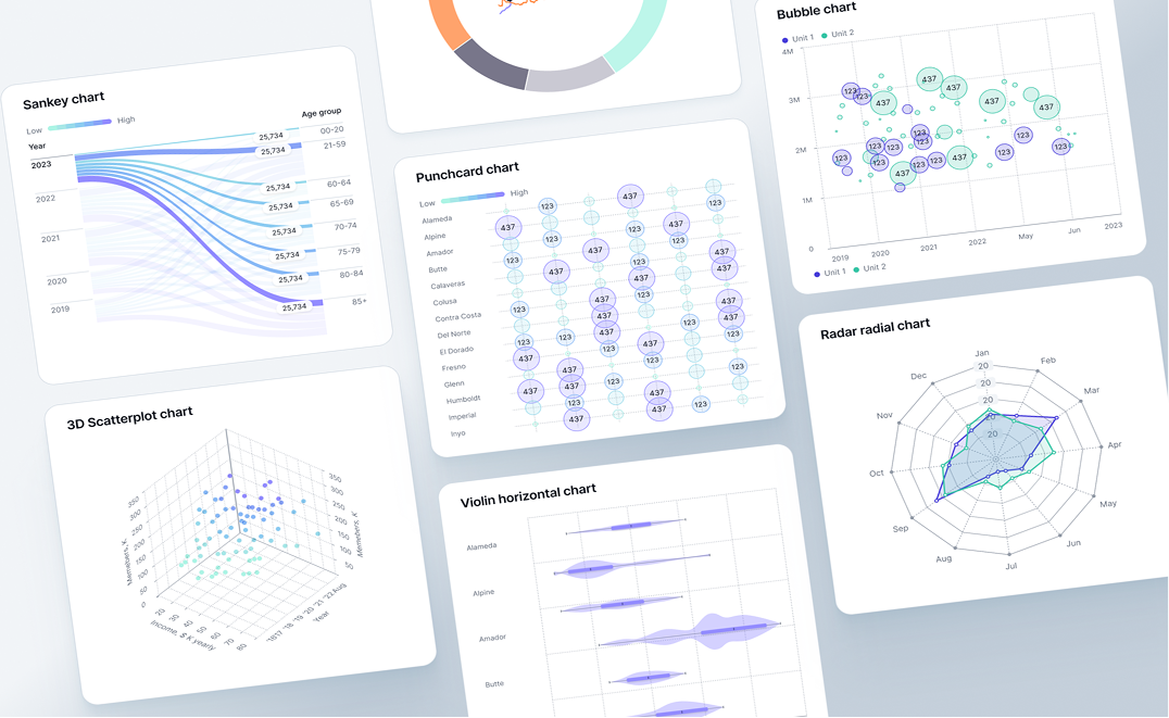
Five Types of AI Dashboard (And What Each One Tracks)
Not every team needs the same view. AI platforms generate different output formats from the same data, depending on what you describe. These are the five types business teams use most often and what each one is built to answer.
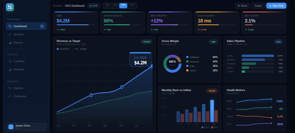
1. KPI Dashboard monitors core performance metrics across the business in real time, with filters teams can explore without analyst support. Operations and executive teams use these for daily standups and weekly performance reviews, keeping everyone aligned on the same numbers.
No one has to wait for a summary email or dig through separate reports. The dashboard answers "how are we doing right now?" on demand, for anyone who has the link. (Revenue, conversion rate, CAC)
2. Financial Dashboard tracks budget versus actual spending, cash flow direction, and P&L variance across cost centers. Finance teams rely on these during monthly close cycles and quarterly planning to spot exactly where numbers are moving, before those movements become surprises in a leadership meeting. The view updates with each data refresh, so the numbers in the room are current, not last week's export. (Budget variance, cash runway, gross margin)
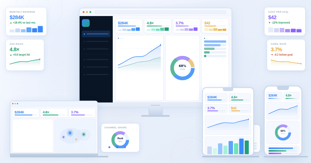
3. Marketing Performance Dashboard connects spend, ROAS, CAC, and pipeline contribution across channels. Marketing teams use AI charts and dashboard views to optimize budget allocation and track how each campaign paces toward quarterly targets, without waiting on an analyst to pull a weekly summary.
Cross-channel comparison is where this pays off most. Seeing which combination of Google Ads, LinkedIn, and email is driving the lowest CAC requires compiling data from three platforms every time someone asks. An AI dashboard generates that view on demand and keeps it current. (ROAS, cost per lead, pipeline contribution)
4. SaaS Metrics Dashboard monitors subscription health, churn, and product usage patterns. SaaS companies use these to catch retention risks before they show up in revenue figures, when there's still time to intervene with targeted engagement or product changes. If your churn rate is moving, you want to know before it hits MRR, not after.
Without a usage dashboard surfacing that pattern, you find out on the invoice. (MRR, net revenue retention, churn rate)
5. Real-Time Monitoring Dashboard updates automatically as data arrives and sends alerts for unusual spikes or drops. Operations teams use a real-time dashboard to catch anomalies as they happen, rather than discovering them in the next morning's report when the window to act has already closed.
A promotion launches at 9am and fulfillment error rates begin climbing at 11am. A real-time dashboard surfaces that while the team can still respond. A static daily report surfaces it the next morning, after customers have already contacted support. (Order volume, error rate, fulfillment SLA)
Your team doesn't need a separate data source for each of these views. A well-designed AI platform generates any of them from a single data connection, on demand, based on what you describe.
When to Use an AI Dashboard vs a Traditional BI Tool
The right choice depends entirely on what problem you're solving, not on which technology is newer or which vendor is spending more on advertising.
Use an AI dashboard when:
- Your business team needs answers from data without waiting for analyst availability or submitting requests through a ticketing system. The bottleneck isn't the data; it's the queue.
- You need to go from raw data to a working dashboard in under an hour, and the reporting need showed up today, not two weeks ago.
- Your reporting needs change frequently and rebuilding views manually costs more time than it's worth. An AI dashboard lets you rephrase rather than rebuild.
- You need to share clean, interactive views with stakeholders or clients who don't have access to your internal BI tools.
Traditional BI still makes sense when:
- Your data environment requires complex SQL modeling, multi-source joins, or custom data transformations that can't be specified through plain language. Some analytical problems genuinely need a data engineer.
- Your organization operates in a regulated industry with strict data governance, audit trail requirements, or access controls that require documented oversight.
- Your team already has dedicated data engineers building and maintaining a BI infrastructure the whole organization depends on, and the cost of switching outweighs the speed benefit.
Fusedash is built for the first group. Business teams, marketing agencies, and SaaS companies that need fast answers from their data without a dedicated data team are where it delivers real value. If your situation requires deep technical modeling or enterprise governance, tools like Tableau or Power BI are the more appropriate choice. If your team submits three or more analytics requests per week and waits more than a day for each, that wait time is the problem an AI dashboard solves.
AI Dashboard Tools Compared (2026)
The comparison below covers the six platforms teams most commonly evaluate, using three practical criteria: how much of the dashboard the platform actually generates for you, how accessible it is for non-technical users, and what it costs to start.
Tableau and Power BI lead in enterprise depth and data modeling capability, but both require technical resources and reflect that in their learning curve and cost. Looker Studio and Metabase suit teams comfortable with manual configuration. Klipfolio works well for agencies tracking KPIs across multiple client accounts.
Fusedash suits teams that need a working KPI dashboard without a dedicated BI resource to build and maintain it. If your team spends more time configuring views than reading them, that's the specific problem Fusedash is designed to solve.